Usability resources and improve commercial ones. Break large, complex tasks into smaller operations. Clear and informed communication
Today, many designers consider animation as something that makes a design more beautiful and vibrant, and rarely use it to improve usability. To improve the usability of the landing page, the animation should be functional element, and not just decoration. If you want to learn how to use animation to make a design both attractive and convenient, then this article is for you.
1. Create a concept
Every designer is a storyteller. When he creates a website, he tells a story to his visitors. By using animation we can make this story even more interesting.
Animation breathes life into content, making it more attractive and memorable. A good example of such animation can be found on the Ikonet website. Animation captivates the user from the first second of being on the page.
Animation can also act as a guide, explaining to the user how to interact with the interface or site. Thereby drawing the user’s attention to important things. For example, if you need to emphasize some information or action, make it slip out from somewhere and be quite noticeable. Take a look at Preston Zeller's example below. Elements appear on pages one at a time, thereby drawing users' attention to certain areas on the page.

2. Provide feedback
Human-computer interaction is based on two main principles: user input and system input. Feedback. All interactive objects must respond to user input with appropriate visual or sound signal. Thus providing feedback.
Below is a custom checkbox effect created using the Slides framework. The subtle bouncing animation that the user sees when using the switch enhances the sense of interactivity.
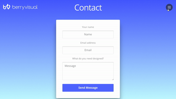
With slides, you can create sweet animations that activate on hover, thereby encouraging users to interact with objects. Take a look at Berry Visual. When you hover over "Send Message" or the menu on the right top corner, a nice animated effect appears. This creates a sense of interactivity among the elements.
Buf Antwerp is another great example of how animated feedback can improve user experience. When visitors hover over a tile, a semi-transparent overlay appears with text that provides Additional information about the object.
 3. Make a connection
A great place to add animation to your landing page is at transition points. Often times transitions seem abrupt, such as when users click on a link and a new window appears. Such changes usually lead to a loss of context, the brain needs to scan the new page to understand how it relates to the previous one, so users may find such transitions difficult to perceive.
Let's look at an example of a sharp transition:

Compare this to the following example, in which a smooth animated transition directs the user to various parts screen:

The second transition is softer. It clearly demonstrates the process of transition between sections, helping users understand what is happening and see the connections between them.

It is also used when creating transitions between stages. The smooth transitions between slides in the example below create a sense of consistency so that the information doesn't look cohesive.

4. Make boring tasks interesting
It may be difficult to imagine how you can add playful elements to your daily routine. But by adding a little surprise to the animation, we can turn a familiar interaction into something fun and memorable.
If you open the Tympanus’ 3D Room Exhibition website, at first glance it will seem like it is no different from other web galleries. But your impression will change immediately after interacting with the page. If you move your cursor, you will see the page move, and this effect will create a feeling of 3D space. This feeling intensifies as you move from one page to another. It's like you're traveling from one room to another in 3D space.

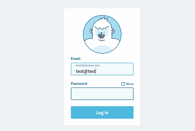
Now let's talk about something more familiar than 3D effects - about shapes. Who loves filling out forms? Probably no one. However, filling out forms is one of the most common tasks on the Internet. How can you make this activity fun?
Look at the picture below, the yeti closes its eyes as the user begins to enter their password. This animated effect is surprising and uplifting, especially if you see it for the first time.
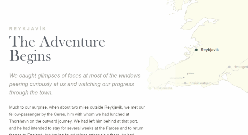
Last but not least, you can make scrolling not only visually interesting, but also useful for readers. Below is , an interactive journey in which the route on the map is animated according to the content on the page. Coherence of the idea visual effects and location allows users to read information and see their movements on the map.
Determining the place on the page where animation will be most useful is only half the story. The implementation of animation is also of great importance. In this section you will learn how to properly animate objects at a professional level.
1. Don't animate multiple objects at once
When multiple objects move at the same time, it is difficult for the user to concentrate. Because a person's eyes will move from one object to another, and the brain will need Extra time to understand what is happening (especially if the movement is happening very quickly). Therefore, it is very important to implement animation correctly.
It's critical to understand the concept of transition choreography, which is a sequence of movements that maintain focus as the interface changes. Minimize the number of simultaneously moving elements. Use no more than two or three moving parts at a time. If you want to set more than three objects in motion, group them and animate them as a whole, rather than individual elements.
Slides are extremely useful in web design because they allow you to use less movement. Every animated effect present in the slides has been carefully designed to effectively present the content.
2. Animation should not conflict with the individual characteristics of the landing page
Every time you add animation to a design, you make it more expressive. Its appearance will largely depend on the animated effect you choose.
When people interact with a product, they have certain expectations. Imagine that when creating a landing page for a banking service, you decide to use a bouncing animation for your data collection form. Many users will be afraid to provide their details because the form does not look serious enough.

Slides framework provides 10 animated styles such as Stack, Zen, Film, Cards and Zoom. Experiment with different effects and choose the one that suits all your criteria best.
3. Set your timing
When it comes to creating animation, timing is everything. He literally decides the fate of animation. When you're working on animation, you typically spend a third of your time finding the right animated effects, and the rest of your time choosing the timing to make the animation look graceful.
The optimal UI animation speed is between 200 and 500 milliseconds. An animation that lasts less than 1 second is considered instantaneous, while an animation that lasts more than 5 seconds can feel drawn out.
When it comes to creating an animated effect, timing has a direct impact on how the animation is perceived. It helps designers make animation more natural and natural.

4. Don't forget about accessibility
Animation is a double-edged sword. It can improve usability for one group of users while creating problems for another group. Release Apple iOS 7 became an example of what not to do. Soon after release operating system, iPhone users reported that animated transitions caused dizziness and eye strain.
You have to target the masses and take into account disabilities such as vision problems and so on. Always check that your design follows WCAG guidelines. Track user requests and comments.
A special CSS media feature, “prefers-reduced-motion,” helps track situations where the user requests to minimize the number of animations.
Additionally, you should conduct usability testing to verify that all users, including those with visual impairments, will have no problem interacting with your design.
5. Test your design solutions
Here are some tips to keep in mind when testing:
- Test on different equipment.
Many hardware specifications such as screen size, screen density, performance GPU and so on, can significantly affect animation performance. As a result, the owner of a higher quality screen will see a different picture than the owner of an older device. Consider these factors and optimize your animation so that it looks great on all devices.
- Test on a mobile phone.
Most websites are created and tested on a PC. Not testing on mobile devices can create a lot of problems for users as some animated techniques work great on PC but not on mobile devices. To prevent users from having a negative experience, make sure your design works great on both desktop and mobile devices.
- Watch the animation at slow speed
It's hard to notice flaws when animation (especially complex ones) is running on full speed. But when you slow down the animation (say, one-tenth the speed), such imperfections become obvious. You can also make a slow-mo video and show it to your friends to get their opinion.
6. Animation should be developed at the beginning
Many designers consider animation unnecessary function because it overloads user interface and complicates it. In most cases this happens, but only because designers add animation at the end of the design process. Random movement without any purpose will not benefit visitors and will most likely be distracting and annoying.
To make animation useful and practical, spend time on it early in your design. Determining where the animation will look logical and natural is very important.
Conclusion
Well-designed and high-quality animation makes the landing page not only more attractive, but also more user-friendly. When done right, animation can turn your landing page interaction into a memorable and engaging experience.
Anyone will agree that practicality and usability are important aspect website design. Whether you're working on a portfolio website, an online store, or a web application, making your pages easier and more enjoyable for visitors is key. key factor. Many studies have been conducted over the years on various aspects of web design and interface, and the results are valuable in helping us improve our work.
1. Form Labels Work Best Above a Field
The study found that the ideal position for form labels is above the data entry fields. On many forms, labels are placed in the left margin, creating two columns, which looks good but is not the easiest layout to use. Why is this happening? Because the form is usually vertically oriented, meaning users fill out the form from top to bottom. The user scrolls down the form. Tracing the label in the box below is easier than finding the box to the right of the label.
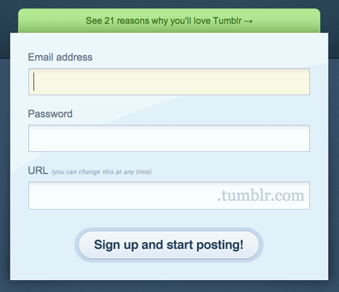
Positioning the label to the left also creates another problem: how do you align labels when aligning left or right? Left matching does the look of expanding, but disables the labels from the field, making it difficult to distinguish which labels apply to which field. Right matching is unfortunate: it makes forms beautiful, but less deployable. Labels above fields work better in most cases. The study also found that the label should not be bold, although this recommendation is not conclusive.

2. Users focus on faces
People instinctively notice other people as soon as they come into their field of vision. On web pages, we focus on faces and eyes, which gives marketers good opportunity to attract attention. But our desire to look people in the face and eyes is just the beginning; it turns out that we actually avert our gaze away from the face we are looking at.

The heat map shows that the eye is drawn to the face of a child looking directly at us.

And now the child looks at the content. Notice the increase in the number of people paying attention to the title and text.
Here's an eye-catching study that demonstrates this. We instinctively turn to faces, but if this face is looking somewhere other than us, we will also look in that direction. Take advantage of this phenomenon by drawing users' attention to the most important part of your page or ad.
3. Design quality is an indicator of trust.
Various studies have been conducted to find out what factors influence people's perception of the trustworthiness of a website.

One of the interesting findings from these studies is that users really do judge a book by its cover... or rather, a website by its design. Elements such as layout, consistency, typography, colors and styles all influence how users perceive yours. Your website should not only look good, but also position itself correctly for your audience.
4. Most users don't scroll or use...
Jakob Nielsen's study on how many users scroll found that only 23% of visitors use scrolling on their first visit to a website. This means that 77% of visitors will not scroll; they simply view the content in the space of the part of the page that is visible on the screen without scrolling down. Moreover, the percentage of users who scroll decreases on subsequent visits, with only 16% scrolling on their second visit. This data shows how important it is that your key places kept in a visible place, especially on landing pages Oh.
This doesn't mean you have to cram everything in top part pages, you just have to do your best efficient use this area. Evicting the contents of that region will simply make the contents unavailable. When users see too much information, they don't know where to start searching for the topic that interests them.

For example, Basecamp uses the space of its website seriously and wisely. Shown at a distance of 768 pixels in height big screen which contains a subheadline, value proposition, call to action, customer list, video and short list possibilities with images.
This is especially important for home page, where most visitors will be strangers. For them, the following should be placed on a visible part:
Name of the site,
The value proposition on the website (i.e. how they will benefit from using the IT),
Navigation for the main sections of the site that are relevant to the user.
However, user habits have changed significantly since then. Recent research shows that users are quite comfortable with scrolling, and in some situations they are willing to scroll to the bottom of the page. Many users are more comfortable with scrolling pages than with numbering, and for many users the most important information about the page, does not necessarily have to be located at the top. So this good idea divide your layout into parts for easier viewing, separating them from big space.
5. Blue is the best color for a link.
When creating a unique design for your website, when it comes to practicality, think about what others do better. Follow symbols because when people visit a new website, the first place they look for information is in places where they would find it on most other sites. They use their experience surfing other sites to make sense of your site. This is called using templates. People expect certain things, such as the color of links, the location of the site logo, the location of navigation tabs, and so on.
Modern trends and approaches in web development
Learn the algorithm for rapid growth from scratch in website building
What color should your links be? The first consideration is contrast: the links should be dark enough to contrast with the background color of your site. Secondly, they should stand out from the color of the rest of the text. Finally, research shows that if practicality is your priority, stick to of blue color for links, it's better. The browser's default links are blue, which is what people expect. Choosing a different color is by no means a problem, but it can affect the speed with which users find what they are looking for.
6. The ideal search window is 27 characters wide.
What is the ideal width for a search box? Jakob Nielsen conducted a study on the dependence of practicality on length search queries search fields on websites. It turns out that most of today's search forms are too short.
The study found that the average search window is 18 characters wide. The data showed that 27% of requests were too long and did not fit into it. Extending the field to 27 characters would accommodate 90% of queries.

Window Apple search too short, cuts off the request " Microsoft Office 2008″.
In general, it's better for search fields to be too wide rather than too short, so that users can quickly scan, validate, and submit a query. This recommendation is very simple, but, unfortunately, too often ignored.
7. White space improves comprehension
Most designers know the meaning of white space, which is empty space between items, pictures, buttons and other elements on this page. White space organizes pages of items, allowing room to breathe. We can also group items together by decreasing the space between them and increasing the space between them and other elements on that page. This is important for demonstrating the relationship between elements (for example, showing that this button applies to this set of items) and building a hierarchy of elements on the page.

White spaces also make the content more readable. Research has found that using spaces between paragraphs is effective. It's easier for the reader to focus on the process if the content is spaced far apart.
In fact, the keyboard layout on a web page (including spaces, headings, indents, and numbers) may not have a noticeable impact on performance, but it does affect user satisfaction with the site.
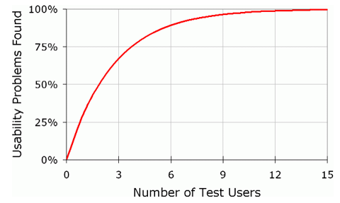
8. Effective user testing doesn't have to be extensive.
Jakob Nielsen researched the ideal number of people who would see a website as impractical. Tests have shown that just five users will identify about 85% of all problems with their site, and 15 users will find almost all problems.
9. A product page will help you stand out.
If your site has product pages, people will certainly look past them when shopping online. But many pages lack information even for visitors who scan the page quickly. This is a serious problem because product information helps people make purchasing decisions. Research shows that poor product information accounts for about 8% of usability problems and 10% of users are dissatisfied with the information provided (i.e. the user gives up and leaves the site).

Give detailed information about your products, but don't fall into the trap of bombarding users with too much text. Make the information easy to digest. Make the page expandable by breaking the text into smaller segments and use a large number of subsections. Add lots of images for your products, and use the right language: don't use jargon so your visitors can understand what you're talking about.
10. Most users don't see ads
Jakob Nielsen reported in his speech that most users are basically blind to banners. If they are looking for a piece of information on a page or are immersed in the content, they will not be distracted by advertising on the side.
The consequence of this is that not only will users avoid ads, but that they will avoid anything that looks like an ad, even if it is not an ad. Some nav styles can look like banners, so be careful with these elements.

The banner spaces on Flashden's left sidebar aren't actually advertisements: they're link content. They pretend to be uncomfortably close to advertising banners and therefore may be ignored by some users.
However, ads that look like content will keep people watching and clicking. This can generate a lot of advertising revenue, but comes at the expense of " target users” because they click on things they believe have genuine content. Before going down this route, consider the trade-off: short-term gains versus the term "long-term credibility."
Translation and editing: Rog Victor and Andrey Bernatsky.
Let's hope that these ten examples usability design of your website, will help you create convenient and high-quality projects.
- Translation
- Tutorial
You are greeted by your clothes and escorted by your mind. This old saying speaks, among other things, about the importance of first impressions. This is true not only for people, but also for software products- websites and mobile applications. One of the most important moments in the formation of attractiveness network project is the ease of use - usability. And when a person first gets acquainted with a site or application, his first impressions often determine whether he will return to this product again and again. In other words, usability is one of the key properties of a website that creates (or destroys) an audience. Let's look at some common and often overlooked user behavior scenarios and ways to improve usability at the most important stages of your website or mobile app experience.
Clear and informed communication
1. Choose font sizes
People are increasingly surfing the web using mobile devices, and for some sites the mobile version has become the main one. And this dictates its requirements for font size, because the screens of smartphones and tablets are much smaller than regular monitors and laptops. Spreading adaptive design played a big role in drawing attention to the problem of fonts.Often, website creators focus on the ease of use of buttons, icons, tabs and other clickable objects. But few remember the convenience of clicking on text hyperlinks. Therefore, always conduct “live” tests of the comfort of clicking on hyperlinks with your fingers.
2. Write informative error messages
Many people neglect the selection of wording for error messages, considering them something secondary. Developers usually know how to avoid incorrect behavior in their products and therefore rarely encounter such messages.But real users cannot boast of this.
If the user does not understand well what to do after an error message appears, then he may abandon your product altogether. Therefore, the message text can be playful, but at a minimum it should help users quickly figure out the reason and avoid failures in the future.
Try to avoid specialized terms, write messages in general terms, in clear language. There is no need to dump information on the user that he cannot use. If desired, even validation errors can be rephrased to make them sound friendlier. Compare two versions of the same screen from the same popular operating system:


Convenience of input forms
3. Simplify your password requirements

Today it is common to require users to create complex passwords. But this needs to be done positively, with encouragement, and not as an insurmountable harsh condition. Many input forms look very nice, but are completely inconvenient. Although the convenience of this interface element can have a decisive impact on the success of the entire product. Unsuccessful solutions can alienate users already at the stage of entering their login and password, or during checkout. Therefore, it is necessary to pay close attention to the ease of use of forms.
For example, historically, select boxes have been difficult to style. In most cases, developers try to hide standard objects and clone them as more suitable DOM elements. In this case, data from the “clones” is transferred to the input of the original elements.
You need to spend a lot of time just to be able to control the design of a regular drop-down menu. But is the game worth the candle? We must not forget that mobile users get used to it very quickly appearance and behavioral characteristics standard elements interface used in their operating systems.

For example, users Windows Mobile They expect that when you select a drop-down menu, the list of options opens in full screen, separate from the field itself. While Android users expect to see modal window. And if, for the sake of your design ideas, you do not meet such expectations, then users may not appreciate your solutions at all. They will likely have a harder time using your product, which will negatively impact their experience. In other words, by changing the design of standard elements you will create more problems than you solve.
4. Use the correct input forms
Many people advise using data formatting in input fields. For example, if you add input, input , then the layout automatically switches as you type. However, this looks strange and does not help at all, but interferes with filling out the form.If you have several input fields, it is better to assign one data type to them. It is much easier for the user when the same layout is used when entering, and jumping from letters to numbers and back only adds additional confusion.

Use different types input in HTML 5 is only advisable when there are as few fields on the screen as possible. Good example - two-factor authentication Google: There is only one field in which you can only enter numbers. It will be very appropriate here automatic switching to a digital layout.
But more complex forms Such “helpfulness” and “initiative” of the keyboard can be annoying, since it forces the user to mentally switch and increases the cognitive load. Especially when switching from letters to numbers, and vice versa:

5. Create a vivid and memorable first-time experience
If a newcomer is disappointed with your site or application from the first seconds, then this is akin to the rudeness of the owner when meeting guests. No matter how delicious the treats are, the meeting will be hopelessly ruined.A developer can easily lose sight of some scenarios for the primary use of his product. For example, it’s hard to call a screen overflowing with icons or sections intuitive. You can soften the first use experience, for example, with helpful hints and warning messages, which can be easily turned off.
6. The devil is in the details
All sorts of little things can go a long way in making your product easier to learn. For example, the familiar standard cursor in the first input field will allow you to quickly and painlessly dive into the interface. Ideally, the user should navigate the site or application on autopilot.New users' lack of experience with your product means that some functions may cause serious difficulties. Remember Paperclip from Microsoft Office, which suddenly came out and offered its help, which was more annoying.

Directing a successful first user experience is like walking on a tightrope - it's very difficult to get everything right, but if you succeed, it is more than rewarded with user recognition. For example, the Stumbleupon project is very successful in teaching beginners its basic capabilities.
A good solution may be to integrate the training process into the normal procedure of using the product. For example, when archiving letters in mail application you can display the message “Did you know that you can start archiving using Ctrl + K?” This approach allows for a much gentler training experience compared to traditional “whole application overview” style lessons.
7. Microcopying should not be used as an afterthought.
“Microcopying” refers to all the little instructions and confirmations used in applications.- "Don't worry, we won't let your mailing address leak"
- “You don’t need a bank card for payment”
For example, binding bank card or providing Email For many users this is a rather controversial issue. And unless you represent a time-tested, reputable brand, people will always be wary of providing you with such information. Microcopies can help resolve user doubts

8. Always provide context
Users hate the lack of context. Considering the information flow they constantly have to cope with, people try to abstract from everything unnecessary on the screen and focus on specific things. When infinite scrolling came into fashion, many sites faced one problem: as soon as the user clicked somewhere by mistake, the current position was reset. This is especially unpleasant in cases where a person has scrolled very far down the contents of the site. After just five scrolling screens, an accidental click can become a source of irritation.Most sites today solve this problem using modals and other schemes typical of single-page applications. For example, on Pinterest, when you click on a tile, it doesn’t open new page, and modal. This allows you to explore the details of a particular post without losing your current position or waiting for a new page to load.

On mobile Facebook app The same approach is used: if you click on a photo in the album, it will load in a full-screen modal. It looks almost as if a new page had opened, but when you press the back button you are gently brought back to context.
Users, especially mobile users, do not like it when the screen content changes unexpectedly. This should only be done in response to explicit user actions. For example, news feeds on Twitter and Facebook are forced to update. Otherwise, you would get an unpleasant situation when you are reading a message, and at the same time background process refreshes the feed and dumps you with a bunch of new messages that bury what you read before. It's like a gust of wind ripping a newspaper out of your hands.

Fortunately, Twitter discreetly informs the user when new messages appear and waits for the user to give the download command. That is, a person has complete control over changing the contents of the screen and is not confused.
15. Break large, complex tasks into smaller operations
Nobody likes filling out a full page form. Therefore, all kinds of settings sections, registration forms and profiles will only benefit from logical separation into smaller blocks. Use cards, sections, tabs, side panels. It will be easier for a person to perceive the need for numerous fillings, even if there are several logical blocks on one page.Dividing into logical blocks subjectively simplifies the task of setting up and filling out numerous fields and prevents the feeling of unpleasant work. This is especially important for mobile applications and website versions.

For example, Facebook has spent several years honing the grouping of privacy settings to make them easier to configure. But once upon a time it was so non-trivial task that many simply did not touch these settings. By dividing them into sections, the percentage of users who engage with these pages rather than avoid them has increased.

Another good example breaking a large task into logical blocks - the ordering process. For many web applications, this procedure becomes a critical point, an indicator of the success of the project. When placing an order is divided into stages, then as they go through them, users get a feeling of progress, progress, even if not everything goes smoothly.
Also, division into logical blocks makes it easier to detect and solve emerging problems. After all, no one wants to deal with a message like “Could you please correct the following four points?”
If you force the user to fill out all the fields or configure settings on one, complexly organized page, then you are putting your eggs in one basket. Any error will prevent all other data from being sent.
The same can be said about forms of donation, especially in mobile projects. You probably want the user to think: “Wow, how simple it is” instead of “Yeah, this takes time.” Improving the usability of forms directly affects the profitability of the project.
Most of the above points are quite simple when considered individually. But if you work with this every day, your eyes often become blurred. Therefore, it is important to be able to step back, abstract and look at your brainchild through the eyes of a “new user”.
Tags: Add tags
How can you improve the usability of a website and make it more convenient and enjoyable for all your visitors and readers? Probably every webmaster and blogger asks himself this question when looking at his SDL. I admit, I also puzzled over this more than once. So I decided to think about it again and write down, if not all, then the most important tips and points to improve the quality of sites for people. Here I will touch on ways to improve content quality, site speed, navigation, web design, as well as many other points.
Unfortunately, improving the usability of a website can take a considerable amount of time. There's a lot here technical points that need to be thought through and. However, this business is worth your time. Therefore, if you want to retain your visitors for as long as possible and reduce the bounce rate, then think about increasing the convenience for your visitors from the very beginning of the project.
This is never a bad idea, as it allows you to determine in advance how visitors will interact with your site and how long they will stay on it. In this material I want to give you several useful tips, which in to a large extent will help you increase dwell time and user experience on your site. I also recommend you read. They will be very useful to you!
Content quality
No matter where you look, content will always be the main key feature. It doesn't matter whether it's SEO promotion, usability or some advertising campaigns. The quality of published material has always been, is and will be the main tool of your site. Therefore, try to publish material that would not cause any negative emotions from the visitor. In reality, to improve the quality of your content, there are a number of basic points you need to follow:
- interesting, useful and unique material- this is one of the important points in increasing the quality of your materials. If you publish content that no one needs and is useless, then you can immediately forget about further development your resource. No one will go to it, since there will be nothing useful in it. Therefore, try to give useful and interesting tips for your readers!
- without water and long sheets— long text canvases are not in fashion now! Write only on the topic and not too much. It will be difficult for the user to master the first time great amount text. However, this does not mean that you should not think about revealing the topic. If you see that the topic is quite extensive for one post, then break it into several posts. This will not only benefit the convenience of the reader, but also promote the site. Also, don't try to write too small posts. This has a very bad effect on uniqueness. If possible, add your thoughts, observations, or anything else useful. The optimal text is 500 - 1000 words. The maximum ceiling is 1500 - 2000 words. So focus on these numbers!
- beautiful post design- this is also a lot important point to improve the quality of their materials. Always dilute the text with pictures. They are very good at improving the comprehension of the material and giving a break when reading. You should also use subheadings in your test whenever possible. They are very good at helping you navigate large amounts of information. The possibility of introducing bulleted lists, tables and various audio and video materials. This can greatly improve the quality of the content.

- highlight text- this will help focus the user’s attention on some very important points. Put more important words in bold. Submit the necessary proposals to beautiful blocks. For example, create a text block " Attention" or " Quote". However, do not under any circumstances overdo it. Select only the essentials.
- linking- a very important point not only in website promotion, but also in its usability. By offering your users additional articles on a topic, you not only increase the time a person spends on the site, but also offer him additional tips on similar topics. Also make sure that all links are easily visible and do not blend into the general background. Be sure to check for broken links. It’s unpleasant when the user receives an error when navigating. Another good option would be to withdraw similar posts in the form of miniatures. It will be very attractive!
- write without errors- this will improve the quality of the content. Few people like to read text with big amount gross mistakes. Therefore, always check for errors not only in new, but also in old entries. For example, the text can be checked for errors in the same . I am now slowly correcting my old entries myself.
Website loading speed
Fast loading of your website pages also affects the usability of this project. Nobody likes to wait a long time for the necessary material to download. If your site loads very slowly, then visitors to such a site will definitely not stay for long and will go to look for information elsewhere. Therefore, always try to monitor the speed of your website.
You can check the speed of sites in various services. For example, I like to use the Pingdom service. Try to ensure that your project loads no longer than 3 seconds. There are many ways to reduce website loading speed:
- installing and configuring the caching plugin- this will significantly help you speed up your site, as well as reduce the load on your server. Try to use all types of caching.
- image optimization— reduce the size of photos without losing quality and crop unnecessary areas of the picture. This will reduce the page size and, consequently, its loading time.
- include only necessary functions — stop using unnecessary plugins, modules and scripts. If possible, disable unnecessary functionality in the site itself and do not chase too sophisticated templates for the site. As a rule, such themes contain a lot of unnecessary code, which affects the site’s loading speed.
- database optimization- don't forget to clean a lot excess garbage in your database. If you have a multisite, then take care of creating an advanced database. This way you can significantly reduce the load on your server. If your site is managed by , then I recommend that you take a look.
- switching to a more expensive hosting plan- choose not only good hosting, but also the most suitable tariffs in it. If, after the above optimization, you are still not completely satisfied with the loading speed of your site, then try forking out for a more powerful and expensive plan. You may need a dedicated server for your capabilities.
In general, such moments in website optimization should not be missed either. A person should easily navigate to the pages of your site. However, it’s also not worth it too much. This can have bad consequences for users.
Convenient navigation:
Menu
A convenient website simply must have user-friendly navigation. However, in the pursuit of convenience, the main thing is not to overdo it. This is especially true for drop-down menus. On some sites it is made so varied that navigating through it can cause some kind of negativity. There are a lot of categories of 2-4 levels (picture below). You point at a certain category, and behind it another, and another, and another is revealed. All you have to do is accidentally jerk the mouse and the entire menu collapses. Thus, it turns out to be some kind of accordion.

It is quite difficult to navigate using such a button accordion, so be careful when creating a pop-up menu. Don't make categories more than second level. Among the large number of such sections, it will be more difficult for the user to navigate the site. The ideal option would be to create first-level categories. However, this does not always work out. If your topic is very broad, you may sometimes need to use second-level rubrics (subcategories). They share the theme of the site very well. This way you don't have to lump everything into one category.
Tell me, why can’t we create new categories? Yes, you can create it, but such sections will take up extra bed. And subheadings can specifically separate topics, and besides, such sections can be hidden in the main heading. This saves a lot of space. Therefore, if you plan to use a considerable number of headings, then it may be worth dividing some headings into subheadings. Just don’t use categories higher than the second level, otherwise it will turn out to be a bastard.
In general, you need to thoroughly think through the navigation on the site. If your site has a lot of space, then the categories themselves can also be grouped into various widgets. That is, according to the topic, all sections are divided into several widgets. You can see this navigation on my blog. Now it is used there. There are also hidden subcategories.
 Another good option would be to use graphics in navigation. People perceive graphics faster and better than simple text. Therefore, if you have the opportunity to display various explanatory icons next to the headings, then under no circumstances refuse this. This will only be a plus for you!
Also, in the posts themselves, you need to display a link to the categories in which these posts are published. This way the user will know which category the material belongs to and can then easily navigate to that category. If you use tags, then you also need to display them in your posts. So you will have another one additional navigation. For rubrics, I would recommend you to use bread crumbs.
Site Map
The main tool in easy navigation is a site map for visitors. This is a kind of site content in the form separate page. It contains links to all project records. Everything in one place so to speak! This is very convenient for visitors. They will be able to quickly and clearly view all the posts on your site. There is not even a book that does not include content for convenient search. So why burden your project with this matter. Therefore, be sure to make such a site map for yourself.
Also, don’t lump everything into one pile in your sitemap. Group all content into sections of specific topics. All these sections  highlight it in a different color to make it easier for the user to navigate among a large number of links. Also, as I already said, it would not be superfluous to attach separate graphic icons to each section. If you have a very broad topic, you can make several child maps for each subtopic. Just don't do too much!
This way the user can quickly select the subtopic he needs and then browse through it necessary materials. This is very relevant when you have several hundred posts published on your site. Thus, the user will not need to flip through the pages several times to find only the appropriate subtopic and sections for it. In the future, I also plan to create such an advanced site map.
Page navigation
It is also worth taking care of page navigation. On the site, such navigation is simply necessary. It should be installed on home page site. There are also people who specifically refuse such navigation. I think this is wrong! Even if a menu and site map are available, page navigation is still necessary. This way, users can easily go to second-level pages and view announcements of various posts there. Such navigation can be used in the form of numbers or in the form of text.
If your site has a very large number of comments, then be sure to make page navigation and for comments. This will make it more convenient for the user to navigate a large flow of messages. Display no more than 50 - 60 messages per page.

Also, you should not make a site map in the form of one huge text canvas. If the number of posts on your website or blog is not small, then be sure to include page-by-page navigation on the site map. This will be very convenient for users since no one likes these endless scrolling pages. Also make sure that your site has a site search form.
Web design
- this is the face of your site. If such a face scares the visitor or imparts some kind of negative character, then the person will simply run away from such a site and is unlikely to return to it. Therefore, you should also take care of clothing for your project. I want to tell you that a lot depends on the theme of the site. The main thing here is related to this site in a certain topic. Of course, you are not required to create any masterpieces. However, try to select templates that would best suit your topic and your readers.
If in doubt, the Internet is full of templates. They are divided into separate categories of topics. Choose your direction and view suitable templates. In general, it depends on the topic of the project. If simple and easy is enough for a simple blog free template, then for a large portal you need the most sophisticated template. Maybe even in . For commercial websites, you shouldn’t use simple templates either. You need to look for something beautiful and attractive to attract more visitors.
For commercial websites, I would recommend buying premium templates or ordering a template from scratch. All your sales can largely depend on. Therefore, do not spare money on a solid and high-quality web design. However, in pursuit of quality and beauty, you should not go too far. All this excess can play a cruel joke on you. Templates that are too colorful and stuffed with various types of blocks can scare off visitors. Therefore, know when to stop! Use only those features that are really needed. There shouldn't be anything superfluous!

Availability is also an important point mobile version and applications for your website. Nowadays, with the rapid development of the network and technology, more and more people prefer to use Mobile Internet. It's fast and convenient! Therefore, you definitely need to take care responsive design website and possibly installing mobile applications. So you have a guarantee that when you log in with mobile device to your website, the user will feel comfortable in it.
For quick access all navigation elements will be in the appropriate part of the page, all buttons will be the appropriate size for the device, and browsing the content will be much more convenient. In general, take care of at least the mobile version of the site so as not to lose most of the traffic in the future and improve the usability of the site on mobile devices.
The font itself on the site is of great importance. An inconvenient and bad font will only rape the user. Therefore, do not try to run after beauty. Use only standard ones in your posts. simple fonts. In addition, they are supported by all browsers. I would recommend using the Verdana font in your posts. Font size is also important. Text that is too small is very difficult to read. Therefore, I recommend using a font size of 13 - 14 point.
Be careful with the quantity and quality of advertising on the site. As a rule, this WordPress engine. A large number of various advertisements, as well as terrible pictures in the blocks, will quickly scare away the visitor and leave only a negative response about your site. So think about what you are putting on your site.
 Give Opportunities convenient function commenting on the site. You need to disable the captcha and find other ways to combat spam. If there are huge discussions on a project, then it is better to make tree-like comments and page-by-page navigation to them. Each message should display the commentator's gravatar. Some people hide it on purpose. You can't do that! It turns out that it is not clear who answers to whom. And it’s very convenient for communication. Therefore, such gravatars are always needed and preferably the most optimal size. Images that are too large or too small are unnecessary.
Well, be sure to provide the most beautiful and high-quality subscription. This should include a subscription to Recent Entries site, for new comments on a specific topic, as well as a subscription to in social networks. This entire process should be clear to the user and easy to use. And for bloggers, I would recommend sticking with . This is also very important!
Conclusion
That's all! Or not? If you know any other ways to improve website usability and reduce bounce rates, be sure to write below in the comments. And so, as you can see, there are quite a lot of ways to improve the quality of a site. In theory, this post should have been divided into several articles. It turned out to be too voluminous. However, the topic is very important. In the second part of the topic about I talk about the importance of content, links and user direction.


