Diagrams in Excel. How to create a chart in Microsoft Word. Video: Creating charts in MS Office Excel
Charts help present numerical data in graphic format, significantly simplifying the understanding of large volumes of information. Charts can also be used to show relationships between different data series.
Component office suite from Microsoft, Word program, also allows you to create diagrams. We will tell you how to do this below.
Note: Availability of installed software product Microsoft Excel provides advanced capabilities for creating charts in Word 2003, 2007, 2010 - 2016. If Excel is not installed, Microsoft Graph is used to create charts. In this case, the diagram will be presented with associated data (table). You can not only enter your data into this table, but also import it from text document or even paste from other programs.
There are two ways to add a chart to Word: embed it in a document or insert an Excel chart that will be linked to data in an Excel sheet. The difference between these charts is where the data they contain is stored and how they are updated directly after being inserted into MS Word.
Note: Some charts require a specific arrangement of data on the MS Excel sheet.
How to insert a diagram by embedding it into a document?
An Excel diagram embedded in Word will not change even if you change source file. Objects that were embedded in the document become part of the file, ceasing to be part of the source.
Considering that all data is stored in Word document, it is especially useful to use embedding in cases where you do not need to change this same data taking into account the source file. Also, embedding is best used when you do not want users who work with the document in the future to have to update all related information.
1. Left-click in the place in the document where you want to add a diagram.

2. Go to the tab "Insert".

3. In a group "Illustrations" select "Diagram".

4. In the dialog box that appears, select the desired diagram and click "OK".

5. Not only a chart will appear on the sheet, but also Excel, which will be located in a split window. It will also display example data.

6. Replace the example data presented in the split Excel window with the values you need. In addition to data, you can replace examples of axis labels ( Column 1) and legend name ( Line 1).

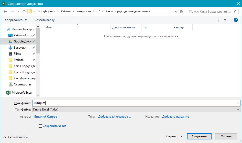
7. After you enter the required data in Excel window, click on the symbol "Changing data in Microsoft Excel" and save the document: "File" — "Save as".

8. Select a location to save the document and enter the desired name.
This is just one of the possible methods by which you can make a chart from a table in Word.
How to add a linked Excel chart to a document?
This method allows you to create a chart directly in Excel, in an external sheet of the program, and then simply paste it into MS Word linked version. Data contained in linked diagram, will be updated when changes/updates are made to the external sheet in which they are stored. Word itself stores only the location of the source file, displaying the related data presented in it.
This approach to creating diagrams is especially useful when you need to include information in a document for which you are not responsible. This may be data collected by another person who will update it as needed.
1. Cut out the diagram from Excel. This can be done by pressing keys "Ctrl+X" or using the mouse: select a diagram and click "Cut out"(group "Clipboard", tab "Home").

2. In your Word document, click where you want to insert the chart.

3. Insert a chart using the keys "Ctrl+V" or select the appropriate command from the control panel: "Insert".

4. Save the document along with the inserted diagram.
Note: Changes you made to the original Excel document(external sheet) will immediately appear in the Word document in which you pasted the chart. To update data when you reopen the file after closing it, you will need to confirm the data update (button "Yes").
IN specific example we have considered pie chart in Word, but this way you can make any type of chart, be it a graph with columns, as in the previous example, a histogram, bubble or any other.
Change the chart layout or style
You can always change the appearance of a chart you create in Word. It is not at all necessary to manually add new elements, change them, format them - there is always the possibility of using a ready-made style or layout, of which the Microsoft program contains a lot. Each layout or style can always be manually changed and customized to suit the required or desired requirements, just as you can work with each individual element of the diagram.
How to apply a ready-made layout?
1. Click on the chart you want to change and go to the tab "Constructor" located in the main tab "Working with diagrams".

2. Select the chart layout you want to use (group "Chart Layouts").
3. The layout of your chart will change.

How to apply a ready-made style?
1. Click on the chart you want to apply to ready style and go to the tab "Constructor".
2. Select the style you want to use for your group chart "Chart styles".
3. The changes will be reflected immediately on your chart.

This way you can change your diagrams on the fly, choosing the appropriate layout and style depending on what you need in your application. this moment. For example, you can create several various templates and then modify from, instead of creating new ones (we'll tell you how to save diagrams as a template below). For example, you have a graph with columns or a pie chart; by choosing the appropriate layout, you can turn it into a chart with percentages in Word.

How to manually change chart layouts?
1. Click on the chart or individual element whose layout you want to change. You can do this another way:
- Click anywhere on the chart to activate the tool "Working with diagrams".
- In the tab "Format", group "Current fragment" click on the arrow next to "Chart Elements", after which you can select the required element.

2. In the tab "Constructor", in Group "Chart Layouts" click on the first item - "Add chart element".
3. From the drop-down menu, select what you want to add or change.

Note: The layout options you select and/or change will only apply to the selected chart element. If you have selected the entire diagram, for example, the parameter "Data Labels" will be applied to all content. If only a data point is selected, changes will be applied exclusively to it.
How to manually change the format of chart elements?
1. Click on the chart or its individual element whose style you want to change.

2. Go to the tab "Format" section "Working with diagrams" and perform the required action:


How to save a diagram as a template?
It often happens that the diagram you created may be needed in the future, exactly the same or its analogue, this is no longer so important. IN in this case It's best to save the diagram as a template - this will make future work easier and faster.
To do this, simply click on the diagram in right click mouse and select "Save as template".

In the window that appears, select a location to save, give the desired file name and click "Save".

That's all, now you know how to make any diagram in Word, embedded or linked, with a different appearance, which, by the way, can always be changed and adjusted to your needs or necessary requirements. We wish you productive work and effective learning.
Information presented in the form of a table is perceived by a person faster than text, and if the same values are shown on a diagram, then they can be easily compared and analyzed.
In this article we will look at how to make a chart in Excel from a table.
Let's take the following range as an example. It displays the number of goods sold by a certain employee for a certain month. Select all the values with the mouse, along with the names of the rows and columns.
Choosing the right type
Go to the “Insert” tab and in the “Charts” group select desired type. For this example, let's build a histogram. Select one of the proposed histograms from the list and click on it.

Excel will automatically produce the result. The axes are labeled on the left and bottom, and the legend is on the right.

How to work with her
appeared on the tape new section "Working with diagrams" with three tabs.
On the Design tab you can "Change chart type", change row and column, choose one of the layouts or styles.

On the Layout tab, you can give it a general name or axes only, display a legend, a grid, and enable data labels.

On the “Format” tab, you can select the fill, outline and shape effect, and style for the text.

Adding new data
Now let's look at how to add new values to it.
If the table is created manually
For example, we added sales information for “June” to our original range. Select the entire column, right-click on it and select “Copy” from the context menu, or press “Ctrl+C”.

Select the diagram and press “Ctrl+V”. A new field will be automatically added to the Legend and data to the histogram.

You can add them in another way. Right-click on the diagram and select from the menu "Select data".


In the “Row Name” field, select the month, in the “Values” field, select the column with sales information. Click “OK” in this window and the next one. The schedule will be updated.

If you used a smart table
If you often need to add information to the original range, then it is better to create a “smart table” in Excel. To do this, select everything together with the headings, on the “Home” tab, in the “Styles” group, select "Format as table". You can choose any style from the list.

Put a tick in the box "Table with headers" and click "OK".

It looks like this. You can expand it by pulling the lower right corner. If you pull to the side, a new month will be added; if you pull to the bottom, you can add a new employee. Let's add a new month and fill in the sales information.

New rectangles are added to the histogram as the cells are filled. Thus, from an ordinary one we have a dynamic table in Excel - when it changes, the diagram is automatically updated.

In the example, the “Histogram” was considered. Using the same principle, you can build any other diagram.
To build a circle, select the appropriate item in the “Diagrams” group. From the data table, select only employees and sales for January.

A bar chart is constructed in exactly the same way as a histogram.

Excel is one of the most best programs for working with tables. Almost every user has it on their computer, since this editor is needed both for work and for study, while completing various coursework or laboratory assignments. But not everyone knows how to make a chart in Excel using table data. In this editor you will be able to use great amount templates that were developed in Microsoft. But if you do not know which type is better to choose, then it would be preferable to use automatic mode.
In order to build such an object, you must perform the following steps.
- Create some table.

- Highlight the information on which you are going to build a chart.

- Go to the Insert tab. Click on the "Recommended Charts" icon.

- You will then see the Insert Chart window. The options offered will depend on what exactly you select (before clicking the button). Yours may be different, since everything depends on the information in the table.

- In order to build a diagram, select any of them and click on “OK”.

- In this case, the object will look like this.

Manually selecting a chart type
- Select the data you need for analysis.

- Then click on any icon from the specified area.

- Immediately after this, a list of different object types will open.

- By clicking on any of them, you will get the desired diagram.

To make it easier to make a choice, just point at any of the thumbnails.
What types of diagrams are there?
There are several main categories:
- histograms;

- graph or area chart;

- pie or donut charts;

Please note that this type suitable for cases where all values add up to 100 percent.
- hierarchical diagram;

- statistical chart;

- dot or bubble plot;

In this case, the point is a kind of marker.
- waterfall or stock chart;

- combination chart;
If none of the above options suits you, you can use combined options.

- superficial or petal;

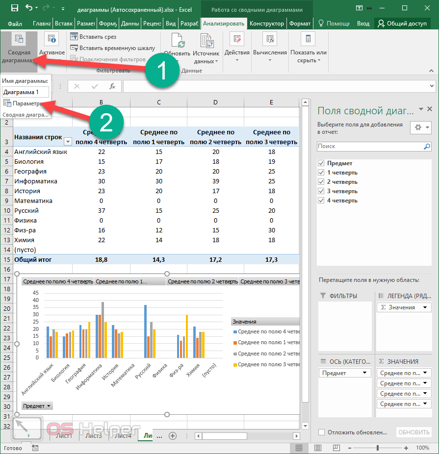
How to make a pivot chart
This tool is more complex than those described above. Previously, everything happened automatically. All you had to do was select the look and type you wanted. Everything is different here. This time you will have to do everything manually.
- Select the required cells in the table and click on the corresponding icon.

- Immediately after this, the “Create PivotChart” window will appear. You must specify:
- table or range of values;
- the location where the object should be placed (on a new or current sheet).
- To continue, click on the “OK” button.

- As a result of this you will see:
- empty pivot table;
- empty diagram;
- Pivot chart fields.

- You need to drag the desired fields into the areas with the mouse (at your discretion):
- legends;
- values.

- In addition, you can configure which value you want to display. To do this, right-click on each field and click on “Value Field Options...”.

- As a result, the “Value Field Options” window will appear. Here you can:
- sign the source with your estate;
- Select the operation that should be used to roll up the data in the selected field.
To save, click on the “OK” button.

Analyze tab
Once you have created your PivotChart, you will be presented with new inset"Analyze". It will immediately disappear if another object becomes active. To return, just click on the diagram again.

Let's look at each section more carefully, since with their help you can change all elements beyond recognition.
PivotTable Options
- Click on the very first icon.
- Select "Options".
- This will open the settings window. of this object. Here you can set the desired table name and many other parameters.

To save the settings, click on the “OK” button.
How to change the active field
If you click on this icon, you will see that all tools are not active.

In order to be able to change any element, you need to do the following.
- Click on something on your diagram.

- As a result, this field will be highlighted in circles.
- If you click on the “Active Field” icon again, you will see that the tools have become active.

- To make settings, click on the appropriate field.

- As a result, the “Field Options” window will appear.

- For additional settings go to the "Markup and Print" tab.

- To save changes made, you must click on the “OK” button.
How to insert a slice
If you wish, you can customize the selection by certain values. This feature makes it very convenient to analyze data. Especially if the table is very large. In order to use this tool, you need to take the following steps:
- Click on the “Insert Slice” button.
- As a result, a window will appear with a list of fields that are in the pivot table.

- Select any field and click on the “OK” button.

- As a result of this, a small window will appear (it can be moved to any convenient place) with all the unique values (totals) for this table.

- If you click on any line, you will see that all other entries in the table have disappeared. All that remains is where the average value matches the selected one.

That is, by default (when all lines are selected in the slice window blue) the table displays all values.
- If you click on another number, the result will immediately change.

- The number of lines can be absolutely any (minimum one).

It will change like pivot table, and a diagram that is built according to its values.
- If you want to delete a slice, you need to click on the cross in the upper right corner.

- This will restore the table to its original form.

In order to remove this slice window, you need to take a few simple steps:
- Right-click on this element.
- After this, a context menu will appear in which you need to select the “Delete ‘field name’” item.

- The result will be as follows. Please note that the panel for setting the fields of the pivot table has again appeared on the right side of the editor.

How to insert a timeline
In order to insert a slice by date, you need to take the following steps.
- Click on the appropriate button.

- In our case, we will see the following error window.

The point is that to slice by date, the table must have the appropriate values.
The operating principle is completely identical. You will simply filter the output of records not by numbers, but by dates.
How to update data in a chart
To update information in the table, click on the corresponding button.

How to change build information
To edit a range of cells in a table, you must perform the following operations:
- Click on the “Data Source” icon.
- In the menu that appears, select the item of the same name.

- Next, you will be asked to specify the required cells.
- To save the changes, click on “OK”.

Editing a chart
If you are working with a chart (no matter which one - regular or summary), you will see the “Design” tab.

There are a lot of tools on this panel. Let's take a closer look at each of them.
Add element
If you wish, you can always add some object that is missing in this template diagrams. To do this you need:
- Click on the “Add chart element” icon.
- Select the desired object.

Thanks to this menu you can change your chart and table beyond recognition.
If you don't like the standard template when creating a chart, you can always use other layout options. To do this, just follow these steps.
- Click on the appropriate icon.
- Select the layout you need.

You don't have to make changes to your object right away. When you hover over any icon, a preview will be available.

If you find something suitable, just click on this template. The appearance will automatically change.
To change the color of the elements, you must follow these steps.
- Click on the corresponding icon.
- As a result, you will see a huge palette of different shades.

- If you want to see what this will look like on your chart, just hover over any of the colors.

- To save changes, you need to click on the selected shade.
In addition, you can use ready-made themes. To do this you need to do a few simple operations.
- Expand full list options for this tool.

- In order to see how it looks in an enlarged form, just hover over any of the icons.

- To save changes, click on the selected option.
In addition, manipulations with the displayed information are available. For example, you can swap rows and columns.

After clicking this button, you will see that the diagram looks completely different.
This tool is very helpful if you cannot correctly specify the fields for rows and columns when building a given object. If you make a mistake or the result looks ugly, click on this button. Perhaps it will become much better and more informative.

If you press again, everything will go back.

In order to change the range of data in the table for plotting a chart, you need to click on the “Select data” icon. In this window you can
- select the required cells;
- delete, change or add rows;
- edit the horizontal axis labels.

To save the changes, click on the “OK” button.
How to change chart type
- Click on the indicated icon.
- In the window that appears, select the template you need.

- When you select any of the items on the left side of the screen, possible options to build a diagram.

- To simplify your selection, you can hover over any of the thumbnails. As a result, you will see it in an enlarged size.

- To change the type, you need to click on any of the options and save using the “OK” button.
Conclusion
In this article, we took a step-by-step look at the technology for constructing charts in the Excel editor. Besides this, there was Special attention paid attention to the design and editing of created objects, since it is not enough to be able to use only ready-made options from Microsoft developers. You must learn to change the appearance to suit your needs and be original.
If something doesn't work for you, you may be highlighting the wrong element. It is necessary to take into account that each figure has its own unique properties. If you were able to modify something, for example, with a circle, then you won’t be able to do the same with the text.
Video instruction
If for some reason nothing works out for you, no matter how hard you try, a video has been added below in which you can find various comments on the actions described above.
Speaker Deck SlideShare
Basics of working with diagrams. How to choose the right chart for your data. Quick formatting charts and layout changes. Fine-tuning the diagram. Using quick analysis tools.
Microsoft Office Specialist Exam Skills (77-420):
Theoretical part:
- Basics of working with charts (graphs)
Video version
Text version
Let's return a little to the rules for placing information on Excel sheets; we already know that a sheet Excel workbooks consists of cells containing three types of data: text, formulas or numbers, but Excel also provides a so-called hidden layer on which charts, images and everything that can move freely above the surface of the sheet are placed. Diagrams are also called graphs.
Excel has simply the richest capabilities for constructing charts of various types. It is almost impossible to learn all the tricks, as the world's Excel gurus, such as John Walkenbach, admit. The reason is not so much the wealth of settings for Excel charts, but the inexhaustible possibilities of their use. In fact, it is a constructor that can be used to implement spectacular diagrams that are missing in standard set Excel. We will look at some of these implementations; perhaps they will encourage you to create your own masterpieces of sample visualization.
Working with charts
The “Insert” tab of the “Diagrams” and “Sparklines” group is responsible for working with diagrams (they are also called infolines, mini-diagrams placed in one cell).
Commands for inserting charts
Working with charts is no different from working with other functionality in Excel: you select the data that should be visualized and click on the command of the selected chart, specifying the specific subtype of the chart, for example, if it should be a graph, then what it should be: simple, voluminous, with markers, etc.

You can bring up the Insert Chart dialog box by clicking on the call triangle in the lower right corner of the Charts group of the Insert tab and selecting from there specific type and chart subtype.

After inserting the diagram into Excel sheet To fine-tune it and manage data, two tabs become available to the user: “Designer” and “Format”.
Using the Design tab, the user can change the chart type, select or edit data, add or remove specific elements, and select a design style or layout.

The “Design” tab will become available after selecting the diagram; commands responsible for the diagram layout are concentrated here
If using the Design tab the user can apply a design style to the entire diagram or change color scheme, then the “Format” tab contains commands responsible for formatting the elements of the chart; for example, you can change the color of only one column. This tab is also responsible for the dimensions of the entire diagram.

The “Format” tab will become available after selecting the diagram; commands for formatting the diagram and its individual elements are concentrated here
Microsoft has simplified the process of adding new data to visualize it on a chart; the user just needs to place the cursor in the cell of the range with the data and select the desired chart type. Excel will try to determine the boundaries of the range and display the result as a chart on the screen.
However, this is not The best way, for simple ranges, of course, is suitable, but it is better to initially select the range or ranges with data, and then specify the desired type of chart, so you can be sure that only the necessary data will be visualized in the chart.
To construct a chart, you can use several ranges; they can be either adjacent or located at a distance from each other; in this case, you should hold down the Ctrl key when selecting ranges.

The data for the chart can be on the sheet with the chart, another sheet, or a separate workbook
It will not be possible to immediately select several such “scattered” ranges; they will need to be added after creating the diagram itself.
Adding data to a chart after it has been built can be identified as a third option for creating charts.

Data is added to the chart using the “Select Data” command from the “Data” group of the “Design” tab or the chart context menu.

Not the best way to create, it’s better to start from the completed data.
In fact, the distinction between construction methods is arbitrary, because you can select data, build a chart, and then add additional ranges to it.
There is a fourth way to create a chart - using the quick analysis tool, we will look at it later in this lesson.
What to highlight?
Charts are built using numerical data, which can be either constants (entered directly into a cell) or the result of formula calculations. However, there is also text information, which is used for titles, axis labels, or legends. Moreover, by selecting data for a chart, you can immediately capture the text labels of the ranges.

Excel is good at identifying data and signatures for it
It is impossible not to notice that Excel not only correctly selected the type of chart (combined with an additional axis), but also correctly combined the names of several cells. All that remains is to add the names and labels of the axes (if necessary). Even a well-versed user would have to spend time constructing such a diagram.
On a note
If the chart is highlighted and click fast printing, then only the diagram will be sent for printing.
Moving a chart and resizing a chart
As mentioned earlier, charts in Excel, along with some other elements, are placed on a hidden layer of the sheet; they are not attached to cells, and accordingly, they can be freely moved by simply dragging the mouse.
When selecting a diagram, you need to be extremely careful and click on an empty area inside the diagram, or on its edge, because Clicking on an element inside the diagram, for example, an axis label or title, will lead to its selection and moving operations will affect this element.
Hot combination
Moving a chart while holding down a key Ctrl will cause it to be copied.
If you move the mouse cursor to the border of the diagram and drag, the size of the diagram will change, and the internal elements will increase/decrease in proportion to the change in size. This size adjustment is rough; if you need to precisely set the width and height, this is done in the “Size” group of the “Format” tab with the diagram selected.

If you select several charts and set the size, they will all become the same size
By default, the diagram is added to the same sheet from which the insertion command was executed; such diagrams that occupy an entire sheet are called embedded. In Excel, users can place a chart on separate sheet, this can be done in the following ways:
- Build an embedded diagram and transfer it to a separate sheet. The “Move Chart” dialog box is called either through the context menu on the chart itself, or from the “Design” tab, the “Move Chart” command.
- You can build a diagram on a separate sheet right away, just select the source data and click function key"F11".
The described operations also work in the opposite direction.
One of the features new to Excel 2013 is called "Recommended" charts. Having previously selected the data, you should run the “Recommended Charts” command from the “Charts” group of the “Insert” tab.

The familiar Insert New Chart window will appear, opened in the Featured Charts tab. Excel will analyze the selected range and offer several chart options that the best way interpret the data. If none of the options suits you, you can use the “All diagrams” tab, or select the closest option, and then fine-tune it.
In considering the recommended charts, it would not be amiss to mention the “Row/Column” command, which in one click will change the data along the axes, for example, when analyzing revenue for six products of a fictitious company, Excel incorrectly defined the axes.

Quickly changing a column/row in a chart is useful if Excel has incorrectly identified a data series
Sometimes, swapping rows and columns is useful from the point of view of the analysis being carried out. So, in the first case, the profitability of products by month is shown, while in the second comparative analysis profitability of various products by month. In other words, from the first graph we can conclude that March turned out to be the most profitable for all products, and from the second, that the fifth and second products are the leaders in profitability.
- Choice the right type charts for data visualization
Video version
Text version
Selecting data to represent in a chart
Diagrams- This graphical representation numerical data. Perception graphic information easier for a person. However, an important role also plays right choice data, and the type of chart that will represent the data.
For example, in Figure 3 there are options for presenting sales data for the past year.

In the diagram of the first option, due to significant differences in absolute values categories is not indicative from an analytical point of view. Despite significant changes in the percentage of sales in different periods, it is very difficult to notice this on the diagram and the whole meaning of such a presentation is lost.
The second option uses two charts, the difference in sales is visible here, but, firstly, in this particular case, you can get by with one graph, and, secondly, a graph rather than a histogram is better suited to display the trend.
The third option is presented as a combined (mixed) diagram, which allows not only to visually evaluate the absolute indicators, but also perfectly shows the trend, well, or the absence thereof.
Diagrams are usually created to convey a specific message. The message itself is shown in the title, and the diagram already provides clarity of the statement. To ensure that the presenter is understood correctly, it is very important to choose the right type of chart that will best represent the data. In this lesson question we will look at when to use which type of chart.
Universally recognized guru table processor Excel - John Walkenbach notes that in the vast majority of cases, the message that needs to be conveyed through a chart is a comparison and identifies these types of comparisons:
- Comparing multiple elements. For example, sales by region of the company
- Comparison of data over time. For example, monthly sales volumes and the general development trend of the company
- Relative comparison. In other words, allocating a share as a whole. Here the best option there will be a pie chart
- Comparison of data ratios. A scatter plot can do a good job of showing the difference between income and expenses
- Comparison by frequencies. A histogram can be used to display the number of students whose performance falls within a certain range
- Definition of non-standard indicators. If there are many experiments, the chart can be used to visually identify “anomalies,” or values that differ significantly from the rest.
How to choose the right chart type in Excel
It is impossible to answer this question unambiguously; it all depends on what kind of message the user wants to convey using the diagram. For example, if a company has 6 products that it sells and there is data on sales revenue for past period, then you can use two diagram options:
- Histogram – if you need to visually compare income from different products
- Pie chart - if you need to determine the share of each product in the company's total revenue.
It’s interesting that if you use the recommended charts, Excel itself will offer both the first and second types. Here, however, there are several more options that are absolutely wrong to use, for example, a chart, a funnel, or an area with accumulations.

Sometimes you can build several options and visually determine the best one. Here, let’s look at the diagrams that Excel offers the user and typical scenarios for their use.
Histograms
If not the most, then one of the most common types of diagrams. The histogram represents each point as vertical column, whose height corresponds to the value. Histograms are used to compare discrete sets of data.

In Excel 2016 there are 7 various types histograms: with grouping, with accumulation, normalized with accumulation, the same 3 types in a volumetric version and just a volumetric histogram. You should be careful with 3D diagrams; at first glance they may seem attractive, but in most cases, they are inferior in information content to their two-dimensional counterparts.
Bar charts
If you rotate the histogram 90 degrees, you get a bar chart. The scope of these charts is similar to histograms and, in general, histograms are perceived better, but if the category labels are long enough, then they will look more harmonious on a bar chart.

Excel has incorrectly identified the chart title and needs to be replaced.
In Excel, there are 6 types of bar charts, all types are similar to histograms, but there is no three-dimensional bar chart, since there is no subtype that would allow placing several data series on the third axis.
Schedule
An extremely common type of chart, used to display continuous data or trends.

Exchange rates, company profits or losses for certain period time, site traffic and many other indicators are best depicted in a graph.
In Excel, you can build 7 different subtypes of graphs, including three-dimensional ones.
Pie charts are used to show proportions relative to a whole. All values taken for the pie chart must be positive; negative values will be converted by Excel automatically. Pie charts are convenient to use when you need to depict: a company’s market share, the percentage of successful/failing students, a niche specific program among competitors, etc.

Pie charts are used to show part of a whole. One of the rare cases when a three-dimensional version looks both beautiful and informative.
There is no need to specify values as percentages and ensure that their sum equals 100; Excel will automatically sum the values and distribute the shares. A pie chart is built from one series of data and is one of those rare cases when a three-dimensional chart can look both harmonious and informative. In total, there are 5 types of pie charts, two of which allow for secondary data decoding.

Excel itself will determine what data to put on the secondary chart and, as a rule, will do it incorrectly. Fortunately, correcting the situation is quite simple: in the parameters of the secondary chart series, you can configure not only how many values to include in the secondary chart decoding, but also define some other parameters, for example, size.
A separate subtype of a pie chart is a donut chart—a pie chart for multiple data series. In this way, market share can be depicted over different time periods. But a donut chart can also be suitable for minor data decoding.

If you need to create a pie chart for several data series, then you need to select the donut chart
Scatter plots
Another common type of chart is scatter or scatter plots. The peculiarity of this type of chart is that they do not use a category axis and values are plotted along the X-axis and Y-axis. This type of chart is often used in statistical research to initially determine the presence/absence of a relationship between two variables (number of applications and sales, student attendance and performance, athlete height and 100 m running speed, duration of work in the company and salary, etc. )

Scatter plots are popular in statistics
Excel provides 7 types of scatter charts and two of them are bubble charts, where the size of the bubble depends on the values of the point.
Bubble charts are not the most common feature in reports. general, in fact, a bubble chart is a scatter chart with an additional series of data.
An interesting example of using a bubble chart was demonstrated by John Walkenbach, who “drew” the face of a mouse; let’s reproduce this example too.

After entering the data and plotting the chart, you need to set the scale and set the “Values correspond to” switch to “bubble diameter”
In order to achieve this effect, I had to change the bubble size parameter to “diameter”, set the scale to 290 (default 100) and color the values, because By default, all values have the same color.
Area Charts
This type of chart is quite rare and consists of graphs with shaded areas. If you try to display several rows of data, then it is possible that another row will not be visible under one row, in this case the best way out will use a simple graph, or try to order the data series so that the series with smaller values is in the foreground.

When constructing an area chart, you need to be careful not to hide another behind one row.
If the graphs intersect, i.e. Overlapping cannot be avoided; you can make a transparent fill for the data row that is in the foreground.
As the name suggests, they were created to display prices on stock exchanges, however, they can be used in other cases, for example, using a stock chart you can visualize a graph of temperature changes for February 2016 in Kyiv.

A stock chart can be used not only for its intended purpose
Calculated with a dot in the center average temperature, and the line represents the daily spread. As you can see, February turned out to be surprisingly warm.
Enough rare type diagram showing a three-dimensional surface. The distinctive feature of this type of chart is that it uses color to highlight values rather than data series.

The peculiarity of a surface chart is that values are highlighted in color, not data series.
The number of colors on the surface diagram depends on the price of the main divisions along the value axis: one color - one value.
A surface chart in Excel is not fully 3D and cannot be plotted with data points represented in an x, y, z coordinate system unless "x" and "y" are equal.
Radar charts
A radar chart is an analogue of a graph in the polar coordinate system. A radar chart has a separate axis for each category, the axes originate from the center, and the value is marked on the corresponding axis.

You can display multiple category axes in a radar chart
As an example of use radar chart You can analyze the weekly website traffic for a certain period, as you can see on weekends the number of visitors is significantly less.
If several data series overlap each other, similar to an area chart, you can either make the fill transparent, or you can choose the radar chart option without fill, then you will simply get a graph in the polar coordinate system.
Combined (mixed) chart
Combined or mixed chart is a diagram that combines two types of diagrams. A striking example of the successful use of this type of chart is the very first figure in this question, when the bar chart shows the company's sales income, and the graph on the same chart shows the percentage change compared to the previous year.
In our Excel example correctly analyzed the source data and proposed this type of diagram as recommended. If you haven’t received such an offer from Excel, then making a combination chart yourself is as easy as shelling pears:

Naturally, it is not possible to combine all types of diagrams; the choice is limited various types histograms and graphs.
If you are using a version of Excel older than 2013, then the build process combination chart may vary.
New chart types in Excel 2016
All new diagrams will be of interest to a narrow circle of specialists, for example, funnel-shaped Microsoft chart recommends using to display the number of potential buyers per various stages sales

Funnel chart shows the number of potential buyers at different stages of sales
Let everyone decide for themselves how clear this visualization is.
Chart templates
Sometimes a lot of time is spent building and fine-tuning a diagram. If you need to build several diagrams of the same type and time-consuming, you can simply copy the source and fill it with new data each time.
Although this method has its right to exist, for these purposes it is better to save the original diagram as a template, and then use it just like any other type of diagram.
To save a diagram as a template:
- Create a chart.
- Format the diagram and make settings.
- Select the diagram / call the context menu / select the command “Save as template...”
- Give the template a name.
Excel chart templates have a *.crtx extension. All templates created by the user can be found in the Templates group; accordingly, if you need to change the type of an already created diagram, you should look for a previously saved template there.

- Quickly format charts using styles and layout
Video version
Text version
After creating a diagram, you can change its parameters beyond recognition, detailed settings Diagrams will be covered in the next question, but for now we will apply preset design styles and layouts to the diagram. Using these tools, you can quickly select the appropriate appearance for your chart.
All the necessary tools are located on the additional “Design” tab; we will need commands from the “Chart Layout” and “Chart Styles” groups.

Styles determine the appearance of a chart, and layout determines the presence and placement of chart elements.
Chart styles are a pre-prepared set visual parameters diagrams.
Predefined chart styles are responsible for the external design of chart elements, such as fonts and colors. Additionally, you can experiment with the “Change Colors” command, it will allow you to select a set of colors in addition to the style.
Design styles, as well as color sets, depend on the theme of the Excel workbook itself.
Chart styles do not add or remove chart elements themselves; this is done by the Express Layout drop-down command.

If you have selected a more or less acceptable layout, but a certain element is missing or, conversely, is superfluous, then the drop-down command “Add chart element” will simply provide an abundance of opportunities for adding and arranging chart elements.

To apply a specific style or set color palette, exactly the same as for adding/removing certain elements diagrams, it is not at all necessary to go to the “Design” tab. If you select a chart, three pop-up buttons appear nearby: the top one is responsible for deleting or adding chart elements, the middle one is responsible for changing the style or color palette.
Removing any diagram element is also possible by pressing Delete keys, with preliminary selection of the necessary (or not necessary, as you like) element.

Third pop-up control button will allow you to quickly perform certain manipulations with data. Here you can hide one or more data series without having to rebuild the chart itself.

Using styles and layouts will allow you to quickly change the appearance of your chart, but if you need more fine tuning you should use the commands manual formatting diagram elements.
- Formatting charts in manual mode
Video version
Text version
Having a certain understanding of charts and their construction methods, let's take a closer look at the main elements of the chart: data series (the main element of the chart), axes (main on the left, auxiliary on the right), axis names, chart title, data labels, data table (duplicates the table from the sheet ), grid, legend (data series labels).

It is also customary to distinguish between the chart area and the plot area.

Chart area- this is all the internal space limited by the boundaries of the diagram.
Construction area- this is a space limited by axes; the area where the diagram is drawn can be moved within the area of the diagram itself.
The user can select an element by left-clicking on the element in the diagram and edit it, for example, enter a new value. If it is difficult to select an element with the mouse, there is a drop-down command in the “Current fragment” group on the “Format” tab to select it.

Up to this point, we accepted the components of the diagram in the form in which they were presented in one or another design style; now we will format the elements manually.
It is worth noting that the number of chart elements depends on the type of the chart itself; you can delete or change the location of existing ones, as well as add missing elements, using the “Add Chart Elements” command of the “Chart Layout” group of the “Design” tab.

Formatting text labels
Text labels are axis labels, chart titles, series labels, etc. To format, you must first select the desired element, and then use the commands of the “Font” and “Alignment” groups. If necessary, you can open the Font dialog box and configure even more text label design options. Formatting text labels is no different from formatting regular text in Excel.

Text labels on a diagram are formatted using the “Font” and “Alignment” group commands
If you need to change the chart title or axis labels, users typically click on the element and begin changing the title right in the chart. You can do this, but you can also click on the text label (for example, the title of the chart), put the “=” sign and click on the cell where the intended title is stored. This method is good because the name in the cell can be changed using a formula and it will automatically be reflected on the diagram itself.
Formatting data series (data series)
The “Format” tab from the “Working with Charts” group of additional tabs is responsible for formatting data series. Before you start formatting, you need to learn how to correctly select a specific element of a series (column, point, sector, line, etc.)
So, the first click of the left mouse button on any element of the series will select the entire series, you can select the entire series using the drop-down list from the “Chart Elements” group, and the second click on a specific element will lead to the selection of only this element, accordingly all formatting will apply only to him.
On a note
The first click on a data series will select the entire series, and the second will select a specific element of the series. It can be formatted individually.
After selecting an element, subsequent formatting is performed using the tools of the “Shape Styles” group of the “Format” tab. Here you can select one of the preset styles for shapes, or select individual settings: line thickness, fill and its color, shadows, effects, etc. More deep customization parameters are made using the shape formatting dialog box, which is called up by clicking on the triangle in the lower right corner of the group. By the way, the name of this window, as well as the list of editing commands available in it, depend on the element that is currently selected.

Among interesting parameters, which are configured in this dialog box - the transparency of the fill color, which has not only an aesthetic function, but also a practical one. Transparency will be useful if some rows overlap.
Formatting a legend
Legend on Excel chart is the signature of a series of data. Like any other chart element, the legend can be removed, placed in different areas of the chart, or formatted.

Fine tuning appearance legends are created in the already familiar legend formatting dialog box; here, for example, you can change the color of the legend itself to the style of the data series on the chart, add mirror reflection or other effects.

How to properly move elements within a chart area
Moving chart elements within the chart area can be done in two ways: simply drag with the mouse and select a location with the “Add Chart Element” command. What is the best way to choose element placement?
If you need to make a small movement, for example, move the legend to the right, and not in the center, then this is done with the mouse, but if you need to make drastic rearrangements, for example, place it not at the bottom of the construction area, but at the top under the title or on the side, then it is better to do it using the “Add diagram element” command, because in this case, all other elements will quickly adjust to the new chart layout. If you do such manipulations with the mouse, you will have to tinker a lot (change the size and position of other elements manually) and it is not a fact that the result will suit you.
ROW function
To conclude the review this issue feature should be noted ROW, it appears in the formula bar when you select a specific series of data.

The ROW function is an inferior function; it cannot be used in worksheet cells and other functions cannot be used as arguments, however, you can edit the arguments of the function itself. The practical significance of such an event is questionable, since it’s easier to do everything through the appropriate teams, but it will be useful to get acquainted with for general development.
The syntax of the ROW function is as follows:
ROW(row_name, category_labels, data_range, row_number, dimensions)
- series_name – the optional argument contains a reference to the cell in which the series name used in the legend is written. In our case, this is cell B1;
- category_labels – an optional argument that contains a link to the range of cells where labels for the category axis are written. In our case, this is the range A2:A32;
- data_range – a required argument, contains a reference to the range of cells with data for the series. You can use non-adjacent ranges, in which case they will need to be separated by commas and enclosed in parentheses;
- row_number – a required argument can only be a constant (a number directly in the formula). This argument makes sense only if there are several data series on the chart and shows the order of drawing; if the orange area is assigned the first number, it will be hidden behind the blue area;
- sizes – used only for bubble charts, contains a link to a range with bubble sizes.
As you can see in the ROW function, references to ranges and cells are entered as absolute and with the obligatory indication of the sheet name. At first glance, this may be a little confusing, but if you look closely, the standard absolute links indicating the sheet. Here, by the way, there can be named ranges, but then you must specify the name of the book.

Several tools for quick analysis of the selected range are concentrated here.

Components of the Quick Analysis Tools command
You can apply conditional formatting tools to the selected range, build a chart, this is the fourth way to create a chart that we mentioned earlier, calculate various total values (sum, average, etc.), convert the range into a table (we will consider tables further ) and build sparklines (infolines, mini-charts) - small diagrams that fit into one cell.
When are sparklines useful?
If there is a table with many data series, then using a standard chart would lead to the construction of many graphs and the spectacle would not be the most visual; using sparklines will show the graph for each row of the range separately.

The situation is similar for the other two types of sparklines: “Histogram” and “Win/Loss”.
Adding sparklines to a worksheet
The first and probably the most quick way creating sparklines is done using the quick analysis tool, but you can also build sparklines for the selected range using the “Insert” tab, “Sparklines” group. In this case, you will have to additionally specify the range for displaying infolines; in the case of the quick analysis tool, sparklines are added to the right of the selected range. The range must match the number of rows.

At the beginning of this lesson, we talked about the invisible layer where charts and text blocks are placed. Sparklines are actually charts as one of the types of data in cells, along with text, numbers and formulas. That is why when constructing sparklines, standard rules for filling cells apply, namely, auto-filling. You can build a sparkline for one row, and then use autofill to fill the remaining cells of the range.

Let's look at sparklines as a quick analysis tool in more detail.
After adding infolines to the worksheet, a special “Designer” tab appears for working with mini-charts.

Despite the wealth of settings on the tab, there are not so many adjustable parameters; they mainly relate to appearance.
The “Change data” command allows, in addition to data settings for all or a single sparkline, to configure the display of empty and hidden cells. These settings are similar to those for charts, by default empty values are ignored and the line is not broken, however, you can make it so that there are breaks in places with empty cells or they are treated as zero values.

In the “Show” group you can enable the display of markers for individual or all points. It is convenient, for example, to look at the maximum and minimum.
The “Style” group is entirely devoted to changing the appearance of sparklines; you can separately customize the marker color.
Using the last group, you can configure it so that the sparklines are perceived as a single whole and formatted accordingly, or you can ungroup them, then you can configure each sparkline individually.
The Axis command is the most important in terms of data presentation.

The Axis command allows you to configure various parameters
By default, each series has its own mini-chart, with its own maximum and minimum values, which is convenient for general dynamics, but not for comparing series. The example picture shows the same data, only in the bottom example the axis scale is set to the same for all sparklines. Due to the difference in values, it is impossible to visually trace the dynamics in rows 2-10.

By default, individual maximum and minimum values. This will allow you to track the dynamics regardless of absolute indicators
Other quick analysis tools
To finish off our quick analysis tool, let's format the selected range using conditional formatting, build a graph, add some totals, and add histogram-type sparklines.

The quick analysis tool placed the results under the data, sparklines to the left of the data.
Quick repetition of material:
So-called memory cards, look at the card and try to answer, clicking on the card will display the correct answer. Memory cards are good for remembering key positions classes. All classes this course equipped with memory cards.
Practical tasks:
In the practical part you will find tasks for the last lesson. After completing them, you have the opportunity to compare your version with the answer prepared by the lecturer. It is strongly recommended that you view the solution only after you have completed the task yourself. For some tasks there are small hints
View solution
A large number of Information is usually easiest to analyze using diagrams. Especially if we are talking about some kind of report or presentation. But not everyone knows how to build a graph in Excel using table data. In this article we will look at various methods how can you do this.
First you need to create some kind of table. As an example, we will study the dependence of costs on different vacation days.

- Select the entire table (including the header).

- Go to the "Insert" tab. Click on the “Graphs” icon in the “Charts” section. Select Line type.

- As a result, a simple graph will appear on the sheet.

Thanks to this graph, we can see which days had the highest costs, and when, on the contrary, the lowest. In addition, along the Y axis we see specific numbers. The range is entered automatically, depending on the data in the table.
How to create a graph with multiple data series
Making a large chart with two or more columns is easy. The principle is almost the same.
- To do this, we will add one more column to our table.

- Then we select all the information, including headings.

- Go to the “Insert” tab. Click on the “Graphs” button and select the linear view.

- The result will be the appearance of the following diagram.

In this case, the table title will be the default value - “Chart Title”, since Excel does not know which column is the main one. All this can be changed, but this will be discussed a little later.
How to add a line to an existing chart
Sometimes there are times when it is necessary to add a row rather than build something from scratch. That is, we already have a ready-made graph for the “Main Costs” column, and suddenly we wanted to analyze additional costs.
Here you might think it would be easier to build everything again. On the one hand, yes. But on the other hand, imagine that what you have on your sheet is not what is shown above, but something larger. In such cases, it will be faster to add a new row than to start over.
- Right-click on an empty area of the diagram. In the context menu that appears, select “Select data”.

Please note that in the table, those columns that are used to plot the graph are highlighted in blue.
- After this, you will see the “Select Data Source” window. We are interested in the “Data range for the chart” field.

- Click once in this input field. Then select the entire table as usual.

- As soon as you release your finger, the data will be inserted automatically. If this does not happen, just click on this button.

- Then click on the "OK" button.

- As a result of this, a new line will appear.

How to increase the number of values on a chart
A table typically stores information. But what if the graph has already been built, and more lines were added later? That is, there was more data, but this was not reflected in the diagram.

IN in this example dates from July 15th to July 20th were added, but they are not on the chart. In order to fix this, you need to do the following.
- Right-click on the diagram. In the context menu that appears, select “Select data”.

- Here we see that only part of the table is selected.

- Click on the “Change” horizontal axis (category) label.

- You will be allocated dates through July 14th.

- Select them all the way and click on the “OK” button.

Now select one of the rows and click on the “Edit” button.

- Click the icon next to the “Values” field. Until this moment, you will have the column header highlighted.

- After that, select all the values and click on this icon again.

- To save, click on the “OK” button.

- We do the same actions with the other row.

- Then we save all changes.

- As a result, our graph covers many more values.

- The horizontal axis has become unreadable because there are so many values located there. To fix this, you need to increase the width of the chart. To do this, place the cursor over the edge of the chart area and drag it to the side.

- Thanks to this, the graph will become much more beautiful.

Graphing Mathematical Equations
As a rule, in educational institutions sometimes they give assignments in which they ask you to build a diagram based on the values of some function. For example, imagine in graphically formulas and their result depending on the value of the parameter x in the range of numbers from -3 to 3 in increments of 0.5. Let's look at how to do this.
- First, let's create a table with x values in the specified interval.

- Now let's insert the formula for the second column. To do this, first click on the first cell. Then click on the “Insert Function” icon.

- In the window that appears, select the “Mathematical” category.

- Then find the "Degree" function in the list. It will be easy to find since they are all sorted alphabetically.
The name and purpose of the formula may vary depending on the task. “Degree” is appropriate for our example.
- After that, click on the “OK” button.

- Next you will be asked to enter the original number. To do this, click on the first cell in the “X” column.

- In the “Degree” field, simply write the number “2”. To insert, click on the “OK” button.

- Now hover over the bottom right corner of the cell and drag down all the way.

- You should get the following result.

- Now we insert the formula for the third column.

- We indicate in the “Number” field the first value of the cell “X”. In the “Degree” section, enter the number “3” (according to the conditions of the task). Click on the “OK” button.

- Duplicate the result to the very bottom.

- The table is ready.

- Before inserting a graph, you need to select the two right columns.

Go to the “Insert” tab. Click on the “Graphs” icon. We choose the first of the proposed options.

- Please note that in the table that appears, the horizontal axis has taken on arbitrary values.

- In order to fix this, you need to right-click on the diagram area. In the context menu that appears, select “Select data”.

- Click on the "Change" horizontal axis label button.

- Select the entire first row.

- Then click on the "OK" button.

- To save the changes, click “OK” again.

Now everything is as it should be.

If you immediately select three columns and build a graph based on them, then you will have three lines on the chart, not two. It is not right. There is no need to draw the values of the X series.
Types of charts
To familiarize yourself with the different types of graphs, you can do the following:
- see preview on the toolbar;

- open the properties of an existing diagram.
For the second case, you need to take the following steps:
- Right-click on an empty area. From the context menu, select Change Chart Type.

- After this, you can experiment with the look. To do this, just click on any of the proposed options. In addition, a large preview will be displayed at the bottom when you hover.

IN Excel program exist the following types graphs:
- line;

- stacked chart;

- normalized schedule with accumulation;

- graph with markers;

- volumetric chart.

Decor
As a rule, not everyone is satisfied with the basic appearance of the created object. Some people want more colors, others need more information, and others want something completely different. Let's look at how you can change the design of the charts.
Chart title
In order to change the title, you must first click on it.

Immediately after this, the inscription will be framed and you can make changes.

As a result of this, you can write anything.

In order to change the font, you need to right-click on the title and select the appropriate context menu item.

Immediately after this you will see a window in which you can do the same with the text as in Microsoft editor Word.

To save, click on the “OK” button.
Please note that opposite this element there is an additional “submenu” in which you can select the position of the title:
- above;
- center overlay;
- Extra options.

If you select the last item, you will have an additional side panel, in which you can:
- make a fill;

- select the border type;

- apply various effects:
- shadow;
- glow;

- smoothing and format of a three-dimensional figure;

- size and properties.

To ensure that the vertical and horizontal axis do not remain nameless, you need to do the following.
- Click on the “+” icon to the right of the graph. Then in the menu that appears, check the box next to “Axis names”.

- Thanks to this you will see the following result.

- Editing the text occurs in the same way as with the title. That is, just click on it for the corresponding opportunity to appear.
Please note that to the right of the “Axes” element there is a “triangle” icon. When you click on it it will appear extra menu, where you can specify what information you need.

To activate this function, you must click on the “+” icon again and check the appropriate box.

As a result, a number will appear next to each value, according to which the graph was built. In some cases this makes analysis easier.

If you click on the “triangle” icon, an additional menu will appear in which you can specify the position of these numbers:
- in the center;
- left;
- on right;
- above;
- below;
- data balloon.

When you click on the “Advanced options” item, a panel with various properties will appear on the right side of the program. There you can:
- include in signatures:
- value from cells;
- row name;
- category name;
- meaning;
- leader lines;
- legend key;
- add a separator between text;
- indicate the position of the signature;

- specify the number format.


This chart component is enabled in a similar way.

This will display a table of all the values that were used to create the graph.

This feature also has its own additional menu where you can specify whether you want to show legend keys.

When you click on "Advanced Options" you will see the following.

This chart component is displayed by default. But in the settings besides horizontal lines you can enable:
- vertical lines;
- additional lines in both directions (the drawing step will be significantly reduced).

In the additional parameters you can see the following.

This element is always enabled by default. If you wish, you can turn it off or specify a position on the diagram.

If you turn on this property graphics, you will see the following changes.

Additional options for Bands include:
- fill;
- border.

Additional tabs on the toolbar
Notice that each time you start working with the chart, additional tabs appear at the top. Let's take a closer look at them.
In this section you will be able to:
- add element;
- select express layout;
- change color;
- specify a style (when hovered, the chart will change its preview appearance);
- select data;
- change type;
- move an object.

Content this section constantly changing. It all depends on what object (element) you are working with at the moment.

Using this tab, you can do anything with the appearance of the chart.
Conclusion
This article examined step by step the construction of various types of graphs for different purposes. If things don't work out for you, you may be highlighting the wrong data in the table.
In addition, the lack of the expected result may be due to wrong choice chart type. A large number of appearance options are associated with different purposes.
Video instruction
If you still cannot build something normal, it is recommended that you watch the video, which provides additional comments on the instructions described above.


