Combo chart template. Key Templates for Project Management in Excel
December 2, 2016 at 9:33 pmVacation schedule template (or training schedule or other schedule) in MS Excel file
- Personnel Management
I work as a small manager and am responsible for drawing up and maintaining an up-to-date vacation schedule for my department. This schedule is drawn up at the end of the year for the next year and submitted to the organization’s human resources department. At the same time, the HR department requires it to be provided in a table-list format, but for my work I myself need a visual chart format. In addition, due to the constant postponement of employee vacations this schedule must be kept current.
Not to do unnecessary work and everything that can be automated is a life principle for me. In this article I would like to share my experience of creating a MS EXCEL chart file. Perhaps the resulting template or this experience will be useful to you too.
For those who need this template and who don’t want to bother too much with how it works, here’s the link for viewing and downloading.
For those interested in the design, the following description.
The emergence of a problem
So. The format required by HR officers is shown in the picture below (all names and positions are fictitious):Features of this format:
1. Individual vacation periods are included in the table as separate lines
2. The table indicates the start dates of the vacation and the duration
3. The list is ordered alphabetically by employee last name and ascending start date
A graph is a graph
I also need a vacation schedule for my employees, but I would like to have it in the form of a visual calendar chart (diagram), where employee vacation periods are reflected along the time axis. And in the end I made it like this:
How it's done
To create a chart of this form, I used the chart designer built into MS EXCEL and the “Stacked Bar” chart type.
In order for the horizontal axis of the chart to look like a time scale, the following settings are needed:

The maximum and minimum correspond numerical values start and end dates of the year. In order for the seven-day grid to coincide with the real weeks for the start date of the year, it is better to take not 01/01, but the Monday closest to this date.
As initial given formation graphics, a table located above the graph is used. The print area of the page is set to not print.

In fact, the diagram reflects not only vacation periods, but also the gaps between them (the settings are used to display vacations green filling, and breaks - without filling, that is, transparent).
First row
This is a transparent period from the beginning of time to the start date of the first holiday of the year. The value in the Start1 column is used.
Second row
This is the first leave displayed in green. The value in the “Days 1” column is used - the duration of the first vacation period:
My “Days 1” column is calculated using the formula:

Plus one day because the end date of the vacation is its last day, and not the first working day.
Third row
This is a transparent period from the end of the first vacation to the beginning of the second.
It is also considered a formula, and since this value has no user value, the column in the table is narrowed as much as possible.

Subsequent rows
Here I just want to say “well, and so on...”, in general, the green vacation periods are constructed similarly to row 2, and the transparent gaps between them are similar to row 3. For my task, 5 periods were enough - this is the current template limitation, which can be overcome, continuing the table in width (as far as you have the patience).What about personnel officers?
They just want a list!?Not keeping the same data in 2 places, not creating the possibility of their divergence, is a matter of honor for me. Even if you had to spend time, it’s better to enter formulas once than to edit the data every time. There are no difficulties here - just links from the sheet containing the form for personnel officers to the cells in the same original table.

Cells B through E are filled in with such links in each row. For each row from the source table (each employee), 5 rows were created in this table according to the number of possible vacation periods. For example, field E “Number of calendars. days", for the first employee filled in:
1st line - "=Graph!G5"
2nd line - "=Graph!K5"
3rd line - "=Graph!O5"
4th line - "=Graph!S5"
5th line - "=Chart!W5"
For the next employee, the links will be to the same columns and to next line(this was quite labor-intensive to fill out due to the fact that the form is transposed, and I didn’t figure out how to copy formulas with transposition).
Please note that column E has a filter. It is needed to display only filled vacation periods (it is configured not to display 0).
It remains to automate the row numbering (first column). In the first line I put the number “1” by hand, for the rest I use the formula “=A6+IF(E7=0;0;1)” (using the example of the 2nd line).
That's all. Thank you for attention
Note: The screenshots in this section are taken in Excel, but also apply the procedures described in this section for Outlook, PowerPoint, or Word.
Note: .
If you want to create similar charts based on the chart you created, you can save it as a template.

Note: A chart template contains the chart formatting and colors that were used when it was saved. A chart that is created in another workbook from a template uses the colors from the template rather than the colors of the document theme applied to the workbook. To use document theme colors instead of template colors, right-click the chart area and select Remove formatting that is missing from a style.
To reuse a chart that has been customized, you can save it as a chart template (*.crtx).
Right-click the chart and select Save as template.
In the dialog box Saving a chart template in the dialog box Save as enter a name for the template.
Apply a chart template to a new or existing chart
To apply a custom template to a new chart, select a range in the worksheet and click the menu button Insert > Diagram > Templates > custom template.
To apply a custom template to an existing chart, click the chart and open the tab Chart maker on the ribbon > click the button Change chart type>click the link Templates, and then select a custom template.
Note: Some of the contents in this section may not apply to some languages.
Note: Microsoft website


If you want to reuse a chart you create, you can save it as a template in Excel, and then apply the template to a new or existing chart in Word, PowerPoint, or Excel. The created chart template actually represents new type diagrams that can be used just like any other types.
Note: To save a chart template, you must have Excel application. You can use the Microsoft website to organize your copy of Excel.
Do one of the following:
Create a chart template in Excel
Apply a chart template to a new chart
After you create a chart template, you can apply this custom type to a new chart in Word, PowerPoint, or Excel.
Apply a chart template to an existing chart
After you create a chart template, you can apply this new custom type to an existing chart in Word, PowerPoint, or Excel.
If you want to reuse a chart you create, you can save it as a template in Excel, and then apply the template to a new or existing chart in Word, PowerPoint, or Excel. The chart template you create is actually a new chart type that can be used just like any other chart type.
Do one of the following:
Create a chart template in Excel
Apply a chart template to a new chart
After you create a chart template, you can apply this custom type to a new chart in Word, PowerPoint, or Excel.
Apply a chart template to an existing chart
After you create a chart template, you can apply this new custom type to an existing chart in Word, PowerPoint, or Excel.
My chart template is not listed
By default, chart templates are automatically saved in the /Users/ folder Username/Library/Application Support/Microsoft/Office/Chart Templates to custom types charts were available in the list Templates on the tab Diagrams. If your chart type is not listed Templates In Finder, find the CRTX file and move it to the /Users/ folder Username/Library/Application Support/Microsoft/Office/Chart Templates. In Mac OS X 7 (Lion), the Library folder is hidden by default. To display Library folder in Finder, click menu Go, and then press and hold the OPTION key.
It is gratifying that Microsoft Corporation is doing its best to meet us halfway, providing absolutely free access to your office products for mobile devices. Therefore, you can quite comfortably use the powerful Excel tools on your tall iPhone, iPad and large-sized Android gadgets.
Don’t forget that the proposed templates can be modified to suit your wishes, and can also be printed if you prefer paper to the screen. But before you start making adjustments, read about and working in Excel. With such a wealth of knowledge, you are not afraid of this powerful monster!
1. List of tasks
Even the brightest head with a clear mind and strong memory will one day fail, and you will forget something. It’s good if it’s buying fish food, congratulating your mother-in-law on Mother’s Day, or watering your significant other’s violet. They will gurgle, hiss and croak, but your conscience will remain clear. But what if you don’t pay for an essential item - the Internet? You will be ashamed to look at yourself in the mirror. And on that fateful day, you will break down and promise to make to-do lists. In the meantime, you will be tormented by choosing among, try to start with a simple one.
Assign tasks, set their priority, set a deadline, select a responsible person, monitor progress and leave notes without leaving Excel. The template is already configured for quick sort by date, importance, status and other parameters.
2. Travel budget
Theoretically, even the most unrealistic (and at the same time full-fledged) trip can be done without any financial investment on your part. To do this, you need to enlist support on, find free seats to visit and do a little work for . Such successes come only to seasoned travelers with a fair amount of luck. Although, to be honest, even they have to look for a couple of coins for a call in order to report to their mother about their health. Therefore, any movement outside the boundaries of the place of residence is accompanied by preliminary planning and budgeting. And so that you don’t have to stain sheets of paper and endlessly twist and turn numbers, we suggest turning to for help.
In addition to the calculation itself, the template can display expected expenses in the form of a pie chart. Dividing money into categories in percentage terms will make it clear which expense item is the most voracious.
3. Inventory list
What unites a fire, a flood, theft and the arrival of relatives to stay “for a week”? That's right, there is a high probability of losing the integrity of your property.
Such is human nature that the toad strangles not because of the fact of losing grandma’s socks, but because you generally cannot remember all your accumulated belongings. In such unfavorable situations, it will help you out. And in addition to it, it wouldn’t hurt to take a photo of your mansion with all its contents.
Jokes aside, I can recommend the template to those people who rent out housing. Accepting guests on long term check-in, do not forget to familiarize them with the inventory report against signature. It will serve you well when evicting tenants.
4. Contact list
No matter how hard technical progress tries, it is unable to defeat the “dinosaurs” who do not want to know about the existence convenient tools organizing your contacts. Diaries, notebooks and just scraps of paper - that's all. Usually in such cases they say that the grave will fix the hunchback (hello, wife!). But let's not give up and find a compromise option - .
Electronic sheet your dating list is good for at least two reasons: it’s easy to share and easy to sort using Excel. Therefore, it would not be a bad idea to have a backup option even for those who completely trust.
5. Gantt chart
The good Russian tradition of shaking hands, skipping the advance, relaxing and doing the work the night before reporting day is a rather risky business technique that significantly affects quality. Only planning, dividing tasks into stages and strictly following the schedule can save your reputation.
A Gantt chart is a popular type of bar chart (bar chart) that is used to illustrate a plan or work schedule for a project.
Of course, the power of Excel allows you to create these same . Their strong point is visibility and accessibility.

And even if you don’t have your own business, try planning apartment renovations, preparing for admission, or using the Gantt method. You will appreciate the power of the tool.
6. Family tree
The crowning glory of the wedding celebration - the fight - will go according to the correct scenario only if you clearly divide the warring parties into “us” and “strangers”. And not only alcohol, but also banal ignorance of your relatives can prevent you from understanding the situation.
Of course, the reason chosen for its creation is not the best; there is much better. If you find the template confusing, switch to the Example sheet, which shows the Kennedy family tree.
7. Duty schedule
“Memory lapses” have accompanied humanity since the division of responsibilities appeared. The disease is especially characteristic of childhood. It is the little ones who, more often than their mothers and fathers, forget to wash the dishes, put away the toys and take out the trash. The disease can be treated without the use of medications: just print out the weekly one and write the expected punitive measures under it.
Enter the names of household members in the cells of the template, distributing work by day of the week before and after noon. And don’t forget to hang the printout on the most popular place in the apartment - the refrigerator. Now no one will plead their forgetfulness.
8. Maintenance log
One day, after many years of using the car, you may get the impression that there is not a single original part left in the car. Except for the janitor, of course, he is holy and inviolable. Is it really? The answer can only be obtained if you have made a habit of recording every act of it. Maintenance in special. In addition, the template provides the ability to calculate total amount expenses associated with vehicle repairs.
9. Mileage log
If Elon Musk had been born in the vastness of the Soviet Union, you and I would already be riding electric cars with low level travel costs. Although who am I kidding, this would not have happened. Elon would have smashed his forehead against the wall of bureaucracy and would have drunk himself long ago.
Therefore, car owners, in the old fashioned way, scroll through the flowing dollars before their eyes while the gas station numbers flash. But human nature tends to quickly forget all the bad things, protecting you from thoughts of soap and rope. Of course, I'm exaggerating, but why not find out how much money you spend on constant refueling? And this is easy to do with the help of .

Enter the odometer readings, the number of liters filled and their cost into the form, and you will estimate the cost of one kilometer of mileage. Similar functionality is implemented in mobile applications, for example for Android.
10. Diary
Only for members of society who live by the principle “drink in the morning - the day is free”, the list of tasks ends with the opening of a nearby store. The rest sometimes have to spin no worse than a squirrel in a wheel, stubbornly keeping within a limited time frame. And in order not to forget their list of plans in the turmoil, people prefer to record it in. The proposed template is good because it allows you to divide each working hour into 15-minute segments.
If you use the same chart settings often, you can create a template and save time. Many users do not like to use this feature because they find it too complicated. However, creating a chart template is quite simple. In Fig. Figure 1 shows a chart with many settings that will be saved as a template for use when creating new charts.
Download the note in or format, examples in format
Create a template
Follow these steps:
- Create a diagram that will serve as the basis for your template. It doesn't matter what data you use, but to achieve best result, it is better to fill the template with information that goes well with the diagram you need.
- Complete everything necessary settings and formatting. At this stage, it is determined how the diagrams based on this template will look.
- Make the chart active, then click on it and select from context menu paragraph Save as template. (There is no command on the Excel 2013 ribbon to create a chart template.) A dialog box appears Saving a chart template.
- Provide a name for the template and click Save.
Chart templates are saved as files with the *.ctrx extension. You can create any number of chart templates.
Using a template
To create a chart based on a template you made, do the following.
- Select the data that will be presented in the chart.
- Run the command Insert –> Diagrams –> Featureddiagrams. A dialog box will open Inserting a chart.
- In this window, go to the tab All diagrams.
- Select from the list on the left Templates. Excel will display the image for preview(based on the selected data) for each user template created in the system (Fig. 2).
- Click on the image corresponding to the desired template and click Ok. Excel will create a chart based on the template you choose.
You can also apply the template to an existing diagram. Select the chart and run the command Working with charts –> Constructor –> Changetypediagrams. A dialog box will open that looks exactly like the one Insertdiagrams. Go to the tab Alldiagrams and select the item from the list on the left Templates.

Rice. 2. Choosing a chart template
Create a combo chart
A combination chart combines two types of charts into one picture. For example, a combination chart might use a second (auxiliary) vertical coordinate axis. In the past, creating combo charts in Excel was not so easy, and some of the steps might seem counterintuitive. In Excel 2013, the situation has improved: now creating such charts is easier than ever.
In Fig. Figure 3 shows a histogram with two data series - Temperature and Precipitation. The spread of values for these two indicators is radically different, so the columns reflecting the amount of precipitation are barely visible in the diagram. It is in this case that it is convenient to use a combination chart.

Rice. 3. The scales of the two data series in this diagram are significantly different.
Inserting a Preconfigured Combo Chart
- Select the range A1:C13.
- Run the command Insert –> Diagrams –> Insert Combo Chart. You will see three icons (Fig. 4). Hover your mouse over any of them and see a preview.
- Select the second icon Histogram with grouping and graph on the auxiliary axis. Excel will create a combination chart (Figure 5).

Rice. 4. Excel offers three pre-configured combination chart options

Rice. 5. It only takes a few clicks to create a combo chart like this in Excel.
The chart shows both data series clearly. The main axis (on the left) displays indicators average temperature(columns). The secondary axis (right) describes average precipitation data (lines). It may be useful to add axis names to make them easier to distinguish.
Create a custom combo chart
In some cases, none of the pre-configured combo charts are suitable. However, creating your own (custom) combo chart is not difficult at all.
Run the command Insert –> Diagrams –> Insertcombineddiagram –> Createcustomizablecombineddiagram. A dialog box will open Insertdiagrams With open section Combined(Fig. 6).
Use the controls at the bottom of the window to specify the chart type for each data series. Using checkboxes (if desired), you can specify which data will be plotted along the secondary axis.

Rice. 6. Use the controls at the bottom of this window to configure combination chart
By customizing your own combo charts, you can control many of their components. However, just because Excel allows you to create combination charts does not mean that this feature should be abused. In Fig. Figure 7 shows a custom chart that uses both lines and columns. As you can see, it is not very effective.

Rice. 7. Example of a failed user-created combo chart
Based on materials from the book by John Walkenbach. Excel 2013. . – St. Petersburg: Peter, 2014. – pp. 249–254.
Simplify the process of keeping track of your projects with ready-to-use project management templates in Excel. The value of any template is that it is your starting point and can be used again and again. You don't have to create a framework from scratch every time you need to send a report to stakeholders, communicate a status change, or track tasks. The basis will already be created, and you will only need to add project data.
In this article you will find a description of the main templates for project management in Excel, which you can download for free. We will also look at Various types templates and tell you when it is better to use each of them. Plus, you'll learn how to create a project management dashboard template in Excel from scratch.
We'll also show you how to use project management templates in Smartsheet, a tool for managing all your work with a spreadsheet-like interface. Smartsheet gives you more collaboration than Excel and makes it easier to keep track of your projects.
Project Gantt Chart Template
The project Gantt chart template is one of the most popular templates used by project managers. A Gantt chart takes the data you have about task titles, start dates, due dates, and task durations and transforms it into a cascading horizontal bar chart. This way, you can quickly visualize the order in which tasks need to be completed, and also determine how tasks depend on each other. The Gantt chart is especially effective when managing complex projects with dependencies.
Smartsheet's interactive Gantt chart capabilities make it easy to visualize your project. You can personalize your chart with different colors and symbols to indicate status, or use conditional formatting to highlight tasks assigned to specific team members. Activate the critical path feature to identify dependencies between tasks and find out which tasks directly affect the project completion date. Share your Gantt chart with your team or clients so they stay on top of what's going on.
Project Tracker Template
Gather all your project data together so that anyone associated with your project always knows where to find important information. Using the project tracker template, you can add tasks, change status and priority, specify final results, deadlines, cost, time spent and other important data for your project. If you have major project, a project tracker template will help you keep everything organized.
Using Smartsheet makes it easier for your team to collaborate in real time and stay informed about project progress. You can make changes to the project, assign new people to tasks, change dates and perform other actions thanks to the intuitive and clear interface.
![]()
Agile Project Plan Template
An agile project plan is based on functionality. The plan estimates how long it will take to implement each feature, but does not contain detailed information about how each functionality will be implemented. Since project plans focus on functionality, you can group similar functionality into sprints.
The agile project plan is constantly changing. Once the plan is developed, the project team should monitor it and update the status and timelines as necessary.
This template (also known as an Agile project schedule) allows you to add your tasks, assign responsibility, start and due dates, and status. The duration for each task will be calculated automatically. This template also contains a Gantt chart ( visual representation project timeline) that automatically changes as you add your data to the table.
Smartsheet offers a project template designed for basic agile projects. Plan and manage sprints, product features and tasks, and use the built-in Gantt chart to view your project as a timeline. Your team can update progress, track deliverables, store files, and set alerts, all in one shared spreadsheet.

Project Budget Template

Always stay on top of how your project is on budget by tracking labor costs, material costs, fixed prices, and actual costs. A budget template gives you the ability to keep a close eye on your spending and allows other team members to see whether you're staying within or over your budget. This template can be used for any project, no matter its size.
Track project progress and budget usage in one place in Smartsheet. This project template includes a project status summary, budget variance and schedule, and a Gantt chart with dependencies. You can easily compare estimated and actual labor, materials, and other costs.

Task List Template

Since there are so many constantly changing components in any project, a task list allows you to focus on the most important tasks. You can change due dates every day or even every hour and view your highest priority tasks for the week ahead. Use a task list template when you need to organize individual tasks.
Create a centralized way to view all your responsibilities across multiple projects at once with this to-do list in Smartsheet. Share the spreadsheet with your team to create the level of transparency you need, track task status with custom symbols, and mark items with high priority so that nothing is missed.

Project Timeline Template

A timeline helps you visualize complex information in a convenient, easy-to-understand way. You can track progress, identify potential delays, monitor the actual time remaining to complete each project task, and much more. A timeline is great for a project of any size, especially if you need to communicate status changes to external collaborators or stakeholders.
Smartsheet offers a timeline template designed for simple plans project with tasks, subtasks and timeline in Gantt chart view. Your team can easily update progress, track deliverables, and check status anytime, anywhere.

Issue tracker template
![]()
Often potential problems in projects can easily go unnoticed for some time. However, if left unresolved, these issues can ultimately delay the completion of the entire project and negatively impact the final results. For project tracking purposes, using an issue tracker template can help you quickly identify issues and assign who is responsible for resolving them, so you can resolve issues as they arise. Use this template if you have a medium to large project with big amount changing data.
Track issues and bugs using the Smartsheet Issue and Error Tracker template. Create a custom web form for maintenance staff, testers, or customers to log issues and manage error history in one central location. Then prioritize and close requests.
![]()
Project Timesheet Template
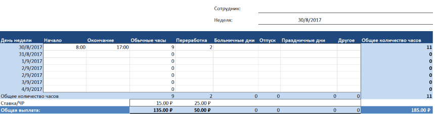
Get a quick snapshot of resource allocation with a timesheet template that allows all team members, as well as stakeholders, to view each team member's level of commitment to the project. Track resource availability for the week ahead so you always know who has it free time to work on a project, and who are very busy. Time sheet – effective method managing a large number of resources in a large project.
Manage your workforce in real time with a template simple project to manage Smartsheet resources. Assign specific performers to tasks and easily identify shortages or excesses of labor resources.

Project Risk Tracker
By their nature, projects are full of hidden risks. The reasons for the occurrence of risks are different: the scope of work is incorrectly determined, dependencies are incorrectly established, etc. The key is to identify such risks in the early stages of the project, before they have time to affect the cost and timing of completion. Project Risk Tracker collects all potential risks in one table, making it beneficial for any medium to large project manager.
Dashboard for project management

You can create a dashboard to manage your project in Smartsheet using Smartsheet Sights dashboards. Sights dashboards give teams unprecedented visibility into the work being done by concentrating data from key project tables. Share your Smartsheet dashboard with your company's employees or share it with external stakeholders, giving them an additional level of insight when viewing key metrics and statuses.
How to Create a Project Management Dashboard in Excel

Here's how to create a project management dashboard in Excel.
Create your Excel spreadsheet
Project management dashboard mainly includes graphic images, but at the same time, the full data on which these images are created should also be stored somewhere in your Excel file. To do this, you need to work simultaneously in two tabs of your Excel tables. One tab will contain the graphic images, while the second tab will contain all the data from which these images will be created. One tab will contain the graphic images, while the second tab will contain all the data from which these images will be created.
- At the bottom of your file, double-click on the tab "Sheet1" to rename the table. We recommend changing the name to "Project Dashboard".
- Then click the plus sign (+) icon to the right of the tab to add another tab.
- Double click on the tab "Sheet2" and rename the table to "Notes".

Add your design details
You can now add your design data (all your "numbers") to the Notes tab. This data will be used to build graphs, which you can then move inside the Project Dashboard tab.
Create a project task table and Gantt chart
- Inside the Notes tab, create a task table. Add column headers “Tasks”, “Executor”, “Start date”, “Due to completion”, “Number of days” And "Status".
- Add your design data to the table. List all the tasks in your project, the person responsible for completing them, the start date, the due date, the number of days allocated to complete each task, and the status (use the options "Completed", "Overdue", "In Progress" And "Not started").

- Then use this data to create a Gantt chart.
- Once you have created a Gantt chart, right-click on the chart and select "Cut out". Go inside the Project Dashboard tab, right-click and select "Insert". You can also cut and paste specific parts of your task name if you want to display them on your dashboard.
Note. We have added a column to the tasks table "A priority" and used star symbols to indicate the importance of completing tasks. To add symbols, click on the cell and on the right side of the tab "Insert" select "Symbols".

Add charts for task status, project budget, and pending items.
Now think about what other information you would like to put on your project dashboard. In our example, we will add a graph for the overall status of tasks, budget, and pending items.
- Go to the Notes tab and create a mini-table for each set of data you want to visualize. For example, we wanted to display how many tasks have the status "Completed", "Overdue", "In progress" and "Not started". We have placed these statuses in one column and next to each other. We also indicated how many projects are in this status as a percentage or share. On the budget chart we showed how much money was budgeted and how much was actually spent.
- Then, after you have added your data, select the table and go to the tab "Insert". In Group "Diagrams" select the chart types you would like to use ( pie charts, histograms, bubble charts, etc.).

- Repeat previous steps for all other data sets.
- Once you have created charts for all data sets, cut and paste them into your Project Dashboard tab.

Set up your project dashboard
- To change the background color of your task table, click on the cell and in the tab "Home" In chapter "Font" Click on the paint bucket icon to select the color you need.
- To change the colors of your Gantt chart, double-click on the taskbar and select the option "Format Chart Area". Click on the paint bucket icon, select "Fill" and then at the bottom of the window select the color you need.
- To change the color for your graphs, double-click on the entire graph or any part of it. A window will appear on the side "Data series format". Click on the paint bucket icon and select the option "Fill", and then at the bottom of the window, click on the paint bucket icon again to select the desired color.
Make better decisions with Smartsheet Sights dashboards
The Smartsheet Sight dashboard helps you visualize, summarize, and share your important aspects work, such as project status or task progress, using key performance indicators (KPIs). Sight's dashboard will also help teams stay organized by giving them a central place for resources, such as collections of tables or reports.
- Dashboards provide visibility key information from project tables in real time.
- Customizable interface suitable for use in any department of your organization
- Simple widgets help you get started quickly.
Sights dashboards offer enhanced visibility for any number of projects, activities and information across the organization. By centralizing workflow information into Sights dashboards, users gain additional insight complex processes, can better anticipate gaps in a project and obtain important information faster.
Use Smartsheet to manage the details of individual projects, then access Sights dashboards to get a high-level view of the status of your project portfolio and provide unprecedented visibility into the work in progress for colleagues and managers. Contact the Smartsheet team to learn how Sights dashboards can benefit your organization.
Excel Templates for Project Management: For Projects Large and Small
A project management template is an effective tool for managing any project: large or small, simple or complex. There is a common misconception that a project must be large and very detailed in order to use templates. In fact, the template can be just as useful for smaller projects. Even if the deliverables are small in size and not very labor intensive, you will still need to estimate how long each task will take, determine necessary resources and assign tasks to each team member.
Smartsheet is a tool based on spreadsheets to manage your work with powerful features for communication and collaboration. With a wide range of smart views—Grid, Calendar, Gantt, Sights, and Cards—Smartsheet works the way you want. Learn how to easily create a project management template. Try Smartsheet free for 30 days.
Would you like to know more about best practices and basic recommendations for project management? Head over to our to access the latest articles, templates, videos and more.
Learn more about Smartsheet premium project management solutions
Do you manage hundreds of projects? Smartsheet's premium project portfolio management solution helps project-oriented businesses and departments increase throughput projects, increase real-time visibility and reduce project risk.
Use Smartsheet Project Portfolio Solution to:
- Save time by automating the setup of a new project.
- Align project management performance with your business goals and objectives.
- Ensure consistent project management policies.
- Improve real-time visibility into project portfolio performance.
- Conduct an in-depth analysis of the project portfolio with using Microsoft Power BI.
Project managers can use Smartsheet's project portfolio management solution to easily and quick receipt standard set tables, reports and Sights dashboards for your new projects. Every new project By default, inherits pre-existing access rights set by the Project Management Manager to ensure visibility of all projects in their portfolio. Finally, the solution automatically collapses project metadata into single file data that can be accessed using the Smartsheet Sights dashboard or Microsoft Power BI for portfolio-wide reporting.


