Adding two gradients to the page. A look at CSS3 gradient (linear and radial gradients). Creating CSS Gradients Without Images
When we talk about gradients in CSS, we're talking about colored gradients.
There are two types of gradients in CSS:
- linear: colors go from one point to another, along straight lines;
- radial: colors go from the center of the circle to its edges, in everyone directions.
The gradient is considered background image and must be used with the appropriate property.
linear-gradient
The syntax for linear gradients is quite complex, but the basic idea is this:
- determine the desired colors;
- where these colors should appear along the axis(at the beginning, middle, end, etc.);
- in which direction there should be a gradient.
Let's start with a simple two-color gradient:
Div ( background-image: linear-gradient(red, blue); )
Default:
- vertical direction, top down;
- first color in beginning(up);
- second color in end(at the bottom).
Changing direction
If the top-down direction does not suit you, you can change it to one of the options:
- define gradient assignment, using keywords like to left top ;
- determine specific corner in degrees, like 45deg.
This direction must be set before color:
Div ( background-image: linear-gradient(to bottom right, yellow, purple); width: 200px; )
If you want to ask specific angle, then you can use the value in degrees:
- 0deg - from bottom to top;
- 20deg - slightly diagonally, going clockwise;
- 90deg - like 15 o'clock, from left to right;
- 180deg is the default, from top to bottom.
Div ( background-image: linear-gradient(20deg, green, blue); width: 150px; )
Adding more colors
You can insert as many colors as you like. They will evenly distributed along the axis:
- two colors: 0% and 100%
- three colors: 0%, 50% and 100%
- four colors: 0%, 33%, 67% and 100%
Div ( background-image: linear-gradient(orange, grey, yellow); width: 150px; )
Defining specific color points
If you do not want the color to be distributed evenly, you can set certain color positions using either percentages (%) or pixels (px):
Div ( background-image: linear-gradient(orange, gray 10%, yellow 50%); width: 150px; )
In these parameters:
- at orange colors no color position specified, so default value is 0%;
- the gray color is closer to the top, by 10% instead of 50%;
- The yellow color occupies half of the gradient, from 50% to the end of 100%.
radial-gradient
While linear gradients follow a single axis, radial gradients spread in all directions. Their syntax is very similar to linear gradients, since both have dots of color. But instead of specifying a direction, you need to specify:
- form: circle or ellipse;
- starting point: which will be the center of a circle or ellipse;
- end point: where the edge of the circle or ellipse will be.
Div ( background-image: radial-gradient(red, yellow); padding: 1rem; width: 300px; )
Default:
- gradient is ellipse;
- first color starts at center;
- the last color ends in the farthest corner.
Starting position
Starting position works like background-position . You can install it via keyword at.
Div ( background-image: radial-gradient(at top right, black, light gray);
width: 300px; )
Gloomy day. the farthest corner End position
- By default, the form ends at
- . You can choose:
- closest-side
- closest-corner
farthest-side
Div ( background-image: radial-gradient(closest-corner at 20px 20px, green, blue); padding: 1rem; width: 300px; ) div:hover ( background-image: radial-gradient(farthest-side at 20px 20px, green, blue)
Hover your mouse over this green star in the sky to see how it expands. Fixed size:
Instead of setting the start and end positions, you can simply set
Div ( background-image: radial-gradient(20px 10px at 75% 50%, darkviolet, pink); padding: 1rem; width: 300px; ) A small purple disk in a pink sea. Gradients in CSS are powerful given
infinite number
options. Vlad Merzhevich The gradient is called
There is no separate property for adding a gradient, since it is considered a background image, so it is added through the background-image property or the generic background property, as shown in example 1.
Example 1: Gradient
Here the obscene idiom traditionally begins the prosaic image, but the language game does not lead to an active dialogical understanding.
Result this example shown in Fig. 1.
Rice. 1. Linear Gradient for Paragraph
In the very simple case with two colors demonstrated in example 1, first write the position from which the gradient will begin, then the start and end colors.
To record a position, you first write to , and then add the keywords top , bottom and left , right , as well as their combinations. The word order is not important, you can write to left top or to top left. In table 1 shows different positions and the type of gradient obtained for colors #000 and #fff, otherwise from black to white.
| Position | Description | View | |
|---|---|---|---|
| to top | 0deg | Down up. | |
| to left | 270deg | From right to left. | |
| to the bottom | 180deg | Top down. | |
| to right | 90deg | From left to right. | |
| to top left | From the lower right corner to the upper left. | ||
| to top right | From the lower left to the upper right. | ||
| to bottom left | From the upper right corner to the lower left. | ||
| to bottom right | From top left to bottom right. |
Instead of a keyword, you can specify the slope of the gradient line, which shows the direction of the gradient. First, the positive or negative value of the angle is written, then deg is added to it.
Zero degrees (or 360º) corresponds to the gradient from bottom to top, then the countdown is clockwise. The slope angle of the gradient line is shown below.

For top left and similar values, the gradient line's inclination angle is calculated based on the element's dimensions so as to connect two diagonally opposite corner points.
To create complex gradients, two colors will no longer be enough; the syntax allows you to add an unlimited number of them, listing colors separated by commas. You can use a transparent color (transparent keyword), as well as a semi-transparent color using the RGBA format, as shown in Example 2.
Example 2: Translucent colors
HTML5 CSS3 IE 9 IE 10 Cr Op Sa Fx
The result of this example is shown in Fig. 2.

Rice. 2. Gradient with translucent colors
To accurately position colors in a gradient, the color value is followed by its position in percentages, pixels, or other units. For example, record red 0%, orange 50%, yellow 100% means the gradient starts out red, then 50% orange, and then all the way yellow. For simplicity, extreme units like 0% and 100% can be omitted; they are assumed by default. Example 3 shows how to create a gradient button where the position of the second color out of three is set to 36%.
Example 3: Gradient Button
HTML5 CSS3 IE 9 IE 10 Cr Op Sa Fx
The result of this example is shown in Fig. 3.

Rice. 3. Gradient button
By setting the position of the color, you can get sharp transitions between colors, which ultimately gives a set of monochromatic stripes. So, for two colors you need to specify four colors, the first two colors are the same and start from 0% to 50%, the remaining colors are also the same and continue from 50% to 100%. In the example, 4 stripes are added as the background of the web page. Due to the fact that the extreme values are automatically substituted, they can not be specified, so it is enough to write only two colors.
Example 4. Plain stripes
HTML5 CSS3 IE 9 IE 10 Cr Op Sa Fx
Typical European bourgeoisie and respectability are elegantly illustrated by the official language.
The result of this example is shown in Fig. 4. Note that one of the gradient colors is set to transparent, so it changes indirectly through the background color of the web page.

Rice. 4. Background of horizontal stripes
Gradients are quite popular among web designers, but adding them is complicated by different properties for each browser and specifying multiple colors. To make it easier for you to create gradients and insert them into code, I recommend the site www.colorzilla.com/gradient-editor with which you can easily set up gradients and immediately get required code. Available ready-made templates(Presets), viewing the result (Preview), adjusting colors (Adjustments), final code (CSS) that supports IE through filters. For those who worked in Photoshop or other graphic editor, creating gradients will seem like a piece of cake, but for others it won’t be difficult to figure it out quickly. In general, I highly recommend it.
- Translation
Work on translation about the singlediv.com project showed that some CSS tools have a wider application than I used to think. But in order to be able to find this application, it is necessary to clearly understand the features of the property. A striking example was linear-gradient, which Lynn Fisher masterfully used in her works.
Want to make it cute gradient background on your website? background-image: linear-gradient(red, blue); ready! Yes, it's a little boring. So if you want something more, I recommend this page with css and MDN tips. Are you here now? Then let's look at some points about how linear gradients actually work. First, let's review the syntax that can be used in the linear gradient function:
linear-gradient ([from<угла>| before<стороны-или-угла>]?,
The function takes an optional first argument that specifies the angle of the gradient, which can be expressed using a unit of measurement (degree, radius, deg, revolution) or as a keyword (side or angle.
The function then accepts a list of colors.
Gradient field
The gradient image has no dimensions, it is infinite unlike other background images. The visible dimensions are given to it by the gradient field, i.e. the area in which it is displayed.Typically, when you use background image as a linear gradient to the DOM element, this area is the element's border frame (which is the very area in which the background color).
Moreover, if you also use the CSS property background-size (background size) and set it to, say, 200px * 200px, then the gradient field will have this size and will, by default, be placed in the upper left corner of the DOM element, unless you also set background-position.
So as you read the following sections, just remember that the gradient box is not always positioned the same or sized as the DOM element you're applying the gradient to.
Gradient line
In a gradient field, the line that passes through the center and along which the colors are distributed is called the gradient line. This line can be described more simply by explaining the gradient angle, so this will be discussed in more detail in the next section.Gradient Angle
Quite obviously, the angle of a linear gradient is used to determine which direction the gradient will go. But let's look at this aspect in more detail.If C is the center point of the gradient field, then A is the angle between vertical line, passing through C, and a gradient line, which also passes through C, and along which the stop colors of the gradient are distributed.
This angle can be determined in two ways:
Using one of the keywords: to top (up), to bottom (down), to left (left), to right (right), to top right (up right), to top left (up left), to bottom right (down right), to bottom left (down left);
Or by defining an angle with a number and a unit of measurement, for example 45deg (45 degrees), 1turn (1 turn);
If the angle is not specified, then by default it is directed downwards (that is, it is 180 degrees or 0.5 turns):

On this and on following images the gradient box is bounded by a rectangle, and the gradient line is the thick gray line that runs through the center along which the colors appear.
In the example above, no angle is specified, so the white to red gradient moves from top to bottom, corresponding to the to bottom keyword, as shown below:

And, as shown in the next 2 images, to top corresponds to an angle of zero degrees:


Another important point Something worth considering when using angle keywords - that to top right, for example, (or any other angle keyword) depends on the dimensions of the gradient box.
The logic is that if you wanted to make a gradient from red to blue towards the top right corner of an element, then the element would have blue in the top right corner, and the purple color in the middle of the gradient would form around a line that extends from the top left to the lower right corner. Here's what it looks like in the image:

Therefore, to top right does not mean that the gradient line passes through the right top corner, and that doesn't even mean the gradient angle is 45 degrees!
Let's take a look at how the gradient line moves as the angle changes with the following animation:

In this animation the angle is tilted from 0 to 360 degrees in 10 degree increments. Low resolution The GIF even gives you a better look at how various colors are displayed as “lines” that are always perpendicular to the gradient line.
Let's remember what we know about gradient angles:
The angle is measured between the gradient line and the line that leaves the center of the gradient field and moves upward.
Therefore 0 degrees means up.
The standard angle value, if not specified, is down, which is 180 degrees.
The angle keywords depend on the size of the gradient field.
Gradient line length
Before we can see how colors are distributed along a gradient line, we need to explain one thing. You may have noticed in the previous animation that the colors are sometimes placed outside of the gradient box, which may look a little strange at first glance, but it makes sense if you know the reason.Look at the example:

We want a red to blue gradient at a 45 degree angle, and due to the aspect ratio of the gradient field, the gradient line cannot go through the top right corner.
But the browser wants (that is, the specifications force it) to make the top right corner pure blue. If we made the gradient line start and end at the edges of the field, then Blue colour took up most of the field, and the gradient would not have spread out so much.
So in order to do this, the gradient line must sometimes extend beyond the gradient box. At the same time, it is quite easy to find out where it begins and where it ends. Simply draw a line that goes through the nearest corner and is perpendicular to the gradient line. The point where this line intersects the gradient line is the start/end location.
In fact, if you specify the width of the gradient field W, the height H, and the angle of the gradient, then the length of the gradient line is:
Abs(W * sin(A)) + abs(H * cos(A))
Colors
The colors represent a comma separated list in which each element can be defined as follows:<цвет> [<процентное соотношение> | <длина>]?
Therefore, it is not necessary to specify where the colors should be placed along the gradient line. For example:

None of the colors have their own position, so the browser itself determined their positions.
Actually simple example with only 2 colors, color 1 will be placed at 0% (at the beginning of the gradient line) and color 2 will be placed at 100% (at the end of the gradient line).
Then, if you add a third color, you will still have color 1 at 0%, color 2 at 50%, and color 3 at 100%, and so on.
In the above example, 5 stop colors were given and the browser calculated their relative position as 0%, 25%, 50%, 75%, 100%. The reason for this is the uniform distribution along the gradient field.
The position of a color can be expressed either by percentage(relative to the size of the gradient line) or as CSS length (where any unit is valid CSS dimensions).
Here's an example:

As you can see, each of the 5 stop colors has its own position, specified in pixels. These positions are calculated from the beginning of the gradient line.
Using such positions, you can get several interesting effects. For example, you can use a gradient to not draw the gradient itself, but leave a few colors:

There are 7 colors in the image above and they are set so that the next color starts at exactly the same position as the last, meaning the browser doesn't have to fill the space between the two stop colors with a gradient.
Sure, that's all nice and funny, but what happens when you mix positioned colors with non-positioned ones? Then you'll force the browser to work harder and ask it to automatically distribute colors for which you haven't specified a position:

In this simple example, the second color (orange) has no position, so the browser determines it and finds a suitable place between the previously specified color and the next color. Here it is very simple, since the immediate neighbors of the second color have their own position, but if only some colors have positions, or if the previous or next colors do not have a position, things get more complicated.
Let's look at a few examples:

In the example above, only the third color (yellow) is positioned at 30%. So to better distribute all the others, the first is placed at 0%, the last at 100%, and the remaining colors are distributed in between (so that orange ends up directly between 0% and 30%, and red between 30% and 100%) .

In the example above, the first and last colors are positioned, so the rest are evenly distributed between these two.

Of course, it would be too simple if 0% and 100% were rigid limits that cannot be exceeded. But as you can see from the previous example, the last color is located at 120%, and therefore all other colors must be distributed accordingly relative to this position (the default starting point in this case remains 0%).
And if you want to make your browser work even harder, why not specify the order of the positions?
In fact, the colors should be in order, but nothing prevents you from doing so, and nothing terrible will happen if you don't. Your browser will simply fix everything as shown below:

Let's start with the first color (red), located at 30%. Then the second color is located at 10%, which is already incorrect, since, as stated above, colors should be indicated in ascending order. So here the browser corrects the position of the second color and sets it to the same position as the previous color (30%). Next comes the third color (yellow) at 60%, which is correct, but it is followed by a fourth (blue) at 40%. Again the position is adjusted and set to the same value as the previous positioned color.

Ultimately, as shown in the example above, the last color (blue) is positioned incorrectly and the browser makes its position the same as the previous color, which in in this case is neither its immediate neighbor (yellow) nor the neighbor of the color that comes before it (orange), so it must fall back to the first color (red). This way, all colors between red and blue are set to 30% and are therefore invisible.
Tools
All the screenshots in this article are from a simple tool I made on codepen that allows you to enter a linear gradient function and see the gradient box, gradient line, angle, and color information on top of the element.The tool has all kinds of bugs and limitations (see javascript comments), so don't expect much from it.
Tags:
- CSS
- linear-gradient
A color gradient is a smooth transition from one specified color to another through intermediate colors. In a linear gradient, the transition occurs in a straight line, from the point A to the point B. The gradient can have more than two reference points - then the transition is made from the point A to the point B, then from point B to the point C and so on.
How to Make a Background Linear Gradient in CSS
In CSS3, you can add a gradient background to elements through the already known background-image property. The value is the linear-gradient() keyword, where in parentheses you need to specify the starting point of the gradient, the starting color and the ending color.
For example, let's make a background linear gradient with a transition from purple to red. In this case, we want the starting point to be purple was with right side, and the gradient vector was directed to the left. Let's write the code:
Background-image: linear-gradient(to left, violet, red);
400x400px Gradient point colors can be written in any format available in CSS, be it, hexadecimal code or other. The direction of the gradient is specified using the to prefix and then the keywords left , right , top and bottom , which can be combined to change the slope. For example:
Background-image: linear-gradient(to bottom right, #ee82ee, #ff0000); 
In addition, you can directly specify the angle of inclination using positive or a negative number with the prefix deg (without a space). At given angle 0º or 360º gradient line will go from bottom to top. As the tilt angle increases, the vector moves clockwise (using a negative value reverses the movement). Example code entry:
Background-image: linear-gradient(-110deg, #ee82ee, #ff0000); 
Multiple anchor points
As we already said, a gradient can have more than two anchor points. In this case, the background will smoothly transition from the first color to the second, from the second to the third, from the third to the fourth and so on until it reaches the final reference point. If you want to increase the number of these points in the gradient, just add them separated by commas. For example:
Background-image: linear-gradient(145deg, #ee82ee, slateblue, #ffd86a, purple); 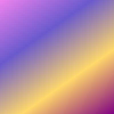
In our example, four reference color points are indicated, but you can add as many of them as you like and in any available color formats.
Transition length
By default, the browser places dots on equal distance, therefore the gradation is uniform. But this distance can be controlled using CSS units. Let's look at the following example:
Background-image: linear-gradient(#92009b 20%, #f5e944 90%, #00ffa2); 
In our code, after the color #92009b the value 20% is indicated. Since it is near the first anchor point, this means that 20% of the element's length will be painted with the specified color. After which the gradient begins: a value of 90% tells the browser to reach the color #f5e944 by 90% of the element's length (starting at 20%). After which the transition to the third color begins in the remaining space - #00ffa2.
This topic also requires practice. Try creating a gradient background with multiple anchor points (more than two), play with the distance values, and watch the gradient change in the browser.
Vendor prefixes
To ensure cross-browser compatibility, some late CSS properties need to be appended with vendor prefixes - special prefixes added by browser developers:
- -webkit- - prefix for Chrome, Safari, Android;
- -moz- is a prefix for Firefox;
- -o- is the prefix for Opera.
Gradient background also requires the use of these prefixes if there is a need for support maximum quantity browsers. To do this, adapt the code as follows:
Background-image: -webkit-linear-gradient(left, violet, red); background-image: -moz-linear-gradient(left, violet, red); background-image: -o-linear-gradient(left, violet, red); background-image: linear-gradient(to left, violet, red);
Adding a prefix requires creating a separate ad. Also, as you may have noticed, properties with vendor prefixes Not require the use of the prefix to when indicating the direction of the gradient.
Internet Explorer support
Unfortunately, the gradient background only works in IE10+. Previous versions do not understand it and will ignore it. To provide at least a normal background in older browsers, you can create a so-called. "stub": select a suitable shade and write the background-color property above property with a gradient. Thus, old browser will apply a “backup” background color and skip properties unknown to it, whereas in a more modern browser, a gradient background will overlay and cover a solid background.
If you have installed translucent gradient(for example, using the RGBA color format) and you don't want the fallback background to show through, set the gradient using the background shorthand property instead of background-image . Then the background-color value will be overwritten to transparent .
Further in the tutorial: repeating-linear-gradient() - repeating linear gradient.
CSS gradients allow you to create a background of two or more colors that smoothly transition from one to another. They have been with us for quite a long time, and have pretty good browser support. Majority modern browsers understands them without prefixes, for IE9 and older there is a Gradient Filter, and for IE9 you can use SVG.
Gradients can be used anywhere images are used: in backgrounds, as list bullets, they can be specified in content or border-image .
Linear-gradient
Linear gradients are quite easy to use. For the most basic gradient, just set the start and end colors:
Background: linear-gradient(oranged, gold);
There can be any number of colors more than two. You can also control the direction of the gradient and the boundaries (stopping points) of the colors.
The direction can be specified in degrees or keywords.
Key words: to top = 0deg ;
to right = 90deg;
to bottom = 180deg - default value;
to left = 270deg .
Keywords can be combined to create a diagonal gradient, such as to top left .
Below you can see how different directions work in stretching from lilac to yellow:
Here is the code for the very first square, for example:
Top-left ( background: linear-gradient(to top left, purple, crimson, orangered, gold); )
One thing to remember is that to top right is not the same as 45deg . The gradient colors are perpendicular to the gradient direction line. With to top right, the line goes from the lower left to the upper right corner, with 45deg - it is located strictly at this angle, regardless of the size of the figure.
The difference is clearly visible in rectangular figures:
You can also set stop points for gradient colors; the values are specified in units or percentages and can be greater than 100% and less than 0%. Examples of setting values in %, in em, and values that go beyond the boundaries of the element: The closer the stopping points of neighboring colors are, the clearer the boundary between them will be. This way you can easily make striped backgrounds:
This can be done, for example, as a background under sidebar, stretched to the full height of the parent element:
The stripes on the sidebar background are another gradient consisting of alternating full transparency and white with transparency 30%. Gradients with translucent colors are convenient because they can be applied over a background of any color.
The gradient in the example is set to complex
long code
, because the stripes should only be placed above the background for the sidebar. If you don't try to make everything the background for one block, you could solve the problem using a pseudo-element. If there are no restrictions, the code can be much shorter: Light ( background: peachpuff linear-gradient(90deg, rgba(255, 255, 255, 0) 50%, rgba(255, 255, 255, .4) 50%) center center / 2em; ) .dark ( background: steelblue linear-gradient(rgba(0, 0, 0, 0) 50%, rgba(0, 0, 0, .2) 50%) center center / 100% 1em )
In the first line we set the background color of the element, type and direction (the color and direction can be omitted), in the second line we define the gradient colors and the border between them, in the third line we set the position and size of the resulting image. The most
It's also important to know that the transparent keyword means transparent black, not transparent white, so if you use it in Firefox you might end up with something like this:
To avoid this, use completely transparent colors of the desired shade, for example, white: rgba(255, 255, 255, 0) or black rgba(0, 0, 0, 0) . About different ways You can read the colors to set.
To find out the rgb notation of a specific color, you can use CSS.coloratum, an instrument from Lea Verou.
In addition to the usual linear-gradient, you can make a repeating-linear-gradient - a repeating gradient
Example code:
Background: repeating-linear-gradient(green, green .5em, transparent .5em, transparent 1em);
Unfortunately, repeating gradients behave haphazardly and are only suitable for patterns that don't care about precision. If you need precision, use linear-gradient in combination with background-size and background-repeat .
Gradients have the same limitation as box-shadow: they cannot be given individual colors or direction. This leads to code duplication and an urgent need to use preprocessors when creating complex gradients.
Another limitation is that gradients are not animated, which, however, can be worked around to some extent.
For quick creation there are a lot of cross-browser gradients handy tool: colorzilla.com/gradient-editor/. In addition to code for modern browsers, it will offer code for older IE and SVG for 9th.
In combination with basic capabilities management background pictures gradients give the broadest opportunities to create backgrounds of varying degrees of complexity without using images at all. You can use gradients to create complex and interesting patterns, but that’s a completely different topic.


