The problem of styling form elements. Submitting a form after selecting a file with input design
Quite a few copies of front-end developers have already been broken by the problem of styling the input input field. The crux of the problem is that the HTML specification does not strict rules, establishing how this element should be displayed by the browser. Moreover, there are no attributes for input that would allow you to change it appearance, by using CSS styles you can only change the appearance of its border and font, and using JavaScript, for security reasons, you cannot simulate a click on this element, which would cause system window to select the *. But what to do when the customer wants a responsive website with beautiful stylized forms that cannot do without this input field?
* - at the time of writing this article, I did not yet know that in all modern browsers, simulating a click on input brings up a system file selection window. Thank you very much for the link to a working example from !
Ways to solve the field styling problem Since this problem has existed (and it has existed for a very long time), several ways to solve it have been found. There are five of them in total: Method No. 1 (the most common) Convince the customer that you can live with standard input. Method No. 2 Write/use a ready-made file loader on a Flash/Java applet. Used, for example, on habrastorage.org Method No. 3 (will be discussed in the article) Use CSS to “mask” the standard input, make it completely transparent and place it in place of a stylized fake field, so that a click on the latter causes a click on the standard one, and, as a result, , opened the system file selection window. Method No. 4 new!(will be covered in the article) Place a transparent input inside the label element, along with arbitrary styled inline elements (except input, button, select and textarea, of course). Clicking on the label will automatically lead to clicking on the hidden field to select a file. Thank you for! Method No. 5 new!
All four of the last methods, of course, have their drawbacks. A significant drawback of the Flash/Java solution is that its operation requires appropriate plugins, which may not be available in the user’s browser. The big disadvantage of the “masking” solution is that to implement it you need to use hacks (this will be discussed below), and also because it is meaningless without using JavaScript (after all, you need to somehow distinguish between the “file not selected” states) and “file selected” for a stylized fake field, which is impossible to do with CSS alone). A solution in JavaScript, in general, would be very good, but, as it turned out in practice, it is not supported by the Internet Explorer browser, as mentioned above. The disadvantage of the solution using label is the same use of JavaScript, however, it is much better than the “masking” method and, in my opinion, should be used now to solve this acute problem.
Bicycle diagram The key task was to create a “rubber” input, which on the screens mobile devices would represent simple button to select a file (the name of the selected file is displayed on it), and on wide screens would look like a familiar text field + button that can stretch across the entire width of the window:Schematic view of the element on mobile devices
Schematic view of the element on desktop devices
This article will discuss three latest methods styling the file selection field. Thus, taking into account the above scheme, the initial layout for “camouflage” method No. 3 will have next view(the order of the children is important!):
Select File not selected
Possible layout for the method using the label element:
Select File not selected
Possible layout for a solution in JavaScript (the same as the layout for the “camouflage” method):
Select File not selected
/* example */
Agreed? Great! Let's start styling our fake file selection field with its “wrapper” - div.file_upload :
File_upload( position: relative; overflow: hidden; font-size: 1em; /* example */ height: 2em; /* example */ line-height: 2em /* the same as height */ )
- the position property is set so that its child elements can be absolutely positioned relative to div.file_upload, and the overflow property is set in order to hide everything that for some reason does not fit into our wrapper (and there is such a thing, but about later). On wide screens, our beautiful field and button should be displayed in one line - let's set the latter to a fixed width and float: right, and to the former a small padding:
File_upload > button( float: right; width: 8em; /* example */ height: 100% ) .file_upload > div( padding-left: 1em /* example */ )
Since we want the text field to be hidden on mobile devices, leaving only a file selection button, we need to set a media query:
@media only screen and (max-width: 500px)( /* example */ .file_upload > div( display: none ) .file_upload > button( width: 100% ) )
Well, now - the fun part of this method! It is necessary to make the standard input completely transparent, and expand it to the size of the “wrapper” div.file_upload . To implement the latter, we will use a hack in the form of absolute positioning and the CSS 3 transform property, with which we will increase the element, for example, 20 times (yes, this is the most common “ magic number»):
.file_upload input( position: absolute; left: 0; top: 0; width: 100%; height: 100%; transform: scale(20); letter-spacing: 10em; /* IE 9 fix */ -ms-transform : scale(20); /* IE 9 fix */ opacity: 0; cursor: pointer )
As you can see from the CSS snippet above, IE 9 required some extra tweaks. This is due to the fact that when this browser clicks on a text field, it does not call up the system file selection window, but kindly offers to “erase” the name of the already selected one, which is symbolized by a blinking text cursor. Therefore, it is additionally given a huge spacing between letters, which increases the element button to the size of div.file_upload . I also note that z-index in in this case not indicated, because the element is the last “child” in the markup selected from the very beginning.
Using the desktop example FireFox browser, now our customized file selection field for different sizes the window looks like this:

File_upload( display: block; position: relative; overflow: hidden; font-size: 1em; /* example */ height: 2em; /* example */ line-height: 2em /* the same as height */ ) .file_upload .button, .file_upload > mark( display: block; cursor: pointer /* example */ ) .file_upload .button( float: right; box-sizing: border-box; -moz-box-sizing: border-box; width : 8em; /* example */ height: 100%; text-align: center /* example */ ) .file_upload > mark( background: transparent; /* example */ padding-left: 1em /* example */ )
However, now there is no need to use the hack to “stretch” a transparent input:
File_upload input( position: absolute; top: 0; opacity: 0 )
"How it works?" or styles for a solution in JavaScript Since the initial layout for this method was chosen to be the same as in the “camouflage” one, the styles for the button and text field for both methods are also the same (except, perhaps, for the cursor: pointer property, which, in in this case, will be applied to the button and text field). The input style can be taken the same as that used in the method using the label element, but it is better to use visibility instead of the opacity property:File_upload input( position: absolute; top: 0; visibility: hidden )
Need more styles! Of course, in such a primitive form, the file selection field is unlikely to suit anyone, so we will add additional styles that will make the file selection button, say, purple, add shadows, etc. Let’s also not forget to add our own style for the button when the cursor is hovered over it, a style for the pressed button, and we’ll also add a style for the entire element when the focus is on it (will be applied when JavaScript help):/* Making it beautiful */ .file_upload( border: 1px solid #ccc; border-radius: 3px; box-shadow: 0 0 5px rgba(0,0,0,0.1); transition: box-shadow 0.1s linear ) .file_upload.focus( box-shadow: 0 0 5px rgba(0,30,255,0.4) ) .file_upload > button( background: #7300df; transition: background 0.2s; border: 1px solid rgba(0,0,0,0.1 ); border-color: rgba(0,0,0,0.1) rgba(0,0,0,0.1) rgba(0,0,0,0.25); border-radius: 2px; box-shadow: 0 1px 0 rgba(255, 255, 255, 0.2) inset, 0 1px 2px rgba(0, 0, 0, 0.05); color: #fff; text-shadow: #6200bd 0 -1px 0; overflow: hidden; nowrap; text-overflow: ellipsis ) .file_upload:hover > button( background: #6200bd; text-shadow: #5d00b3 0 -1px 0 ) .file_upload:active > button( background: #5d00b3; box-shadow: 0 0 3px rgba(0,0,0,0.3) inset )
Now our file selection field looks like this:

Var wrapper = $(".file_upload"), inp = wrapper.find("input"), btn = wrapper.find("button"), lbl = wrapper.find("div");
btn.focus(function())( inp.focus() ));
// Crutches for the:focus style: inp.focus(function())( wrapper.addClass("focus"); )).blur(function())( wrapper.removeClass("focus"); ));
For the method using label, you can remove the section of code responsible for forcing focus from the button to the input (since there we don’t have a button at all, but a span).
For a method the essence of which is to simulate a click on input , you actually need to add this very imitation:
// Yep, it works!
btn.add(lbl).click(function())( inp.click(); ));
and also adjust the code for setting the .focus class, having previously removed the fragment responsible for forcing focus:
It would seem that everything that is required has already been written. And here are the figurines! If you select a file using the “mobile” field, and then increase the window size and transfer the element to “desktop”, then “File not selected” will remain in the text field - you need to update the element every time you change the window size:
$(window).resize(function())( $(".file_upload input").triggerHandler("change"); ));
- FireFox 22.0 (Linux, Windows)
- Opera 12.16 (Linux, Windows)
- Internet Explorer 9
- Chromium 27.0 (Linux)
- Apple Safari (iOS 6.3.1)
- Android browser (Android 2.3.6)
- Android FireFox
Of the advantages of all the approaches discussed in the article, the following main ones can be identified:
- Flash is not used.
- The element can be easily styled using CSS using modern responsive design technologies.
- The field can also be filled in using the keyboard.
Of the main disadvantages:
- The need to use JavaScript (applies to all methods).
- Using CSS hacks to "disguise" things.
- The need to write additional crutches for a field with the multiple attribute (applies to all methods).
- Not cross-browser - all methods lack support for IE 8, and you also need to use “browser” CSS properties to support the rest of the “oldies”.
- JavaScript solution is not supported by everyone Internet versions Explorer, as well as some older versions of others popular browsers(although almost no one uses them anymore).
Which of the three two elegant ways to create a stylized input should you choose for everyday use- you decide. My choice is the method using label (even though it has a non-semantic layout).
Working examples of all three methods can be found on CodePen.
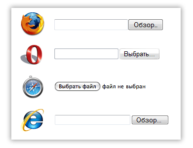
We continue the theme of the eternal confrontation between designers and layout designers. The main conflict arises when the designer draws a picture of the site as the customer needs, and then the layout designer has to adapt various HTML elements. One of the most difficult elements to style is the file selection field, an input element with type file. As clear example, here's how it appears in different browsers:
Input type="file" field in different browsers
Additional complexity is created by the fact that this field is subject to various browser security rules, so it cannot, for example, be replaced with some stylized div, it cannot be wrapped in a label tag, it cannot be directly assigned a value using scripts, or it cannot open a file selection window by simulating a click via element .click(). And in some browsers you cannot even make the file selection field hidden, since after submitting the form its value will not be transmitted to the server. IN different internets I have seen attempts to make a cross-browser solution, but all of them, in fact, are not universal and are limited to specific browsers.
When I needed to solve this problem, I decided to use the already proven trick, in which the desired element is placed inside div block with fixed dimensions and background image, and the element itself is assigned the “transparent” attribute. Not hidden, but completely transparent. I had to tinker a little more so that within the boundaries of the parent div there would be an input area that responds to a mouse click and opens a file selection window. To do this, the font and height of the input itself were maximized. The HTML code is the simplest: The CSS code is not entirely valid due to the use of Internet Explorer browser filters, but this is the price for cross-browser compatibility. As a last resort, if you need 100% validation of the validator, you can set this attribute dynamically using JavaScript or load separate table styles for IE. Now on the screen we see only a stylized button, when clicked, a file selection window opens. The input field for selecting files is not displayed, but it works fine. A small problem remains that some browsers ignore the cursor style and still display it as text over the input field. But, it seems to me, you can ignore this, although it is useful to know about it.
We could finish here, but in some cases we may need the name of the selected file, for example, so that before submitting the form we can execute preliminary check if a file of a certain type is expected. Or, for example, so that the user can check whether he is downloading the right file. In a regular input field, the user sees it anyway, but in our stylized one, he doesn’t. To do this, we will add a handler for the onchange event, the HTML code will be slightly supplemented: and the following script will be added:
Some browsers provide extended access to file properties in the input field; for such browsers, you can get not only the file name, but also its size. Accordingly, such expanded information will be displayed. For other browsers, we will simply show the name of the selected file, this value is always available through the value property of the input field.
A ready-made example of a form with a stylized file selection field and its processing, you can look at
By 1998, when CSS Level 2 was released, form elements were already supported by all major browsers. The CSS 2 specification did not address the presentation problem. Since these elements are part of the user interface, the authors of the specification chose to give them away visual representation at the mercy of browser developers.
Year after year, the insufficiently detailed specification forced web developers to experiment in attempts to bring the presentation of elements such as input , select , fieldset , legend and textarea in different browsers to a “common denominator”. In this article, we'll look at some CSS techniques used by web developers to standardize the visual presentation of form elements.
Tests by Roger JohanssonFirst in 2004 and then in 2007, Roger Johansson created a comprehensive set of tests to test the application of CSS styles to form elements. The results of these tests, which you can find in his article “On Styling Form Elements with CSS,” resulted in a disappointing conclusion, which Johansson expressed in the following words:
So what does this experiment show? As I said, it shows that using CSS for styling form elements in order to bring them to a uniform appearance in different browsers and on different platforms impossible. It also shows that most browsers ignore many CSS properties applied to form elements.
Despite the undoubted validity of these conclusions, web developers continued to actively test the application of CSS styles to form elements in order to find the Holy Grail of their cross-browser presentation, or at least a reasonable compromise between the styles applied by the browser by default and those specified by the developer.
Default modelThe CSS 2.1 specification specifies in its proposed default style sheet for HTML4 that form elements such as textarea , input , and select are inline-block:
textarea , input , select ( display : inline-block; )In turn, the form and fieldset elements are block-level:
fieldset, form (display: block;)The description of the default model proposed by the CSS specification is limited to this. All other visual aspects of form elements depend on the browser's default style sheet. However, the rules listed mean the following:
Inline block elements can be styled using the inline model. It allows you to use CSS properties such as line-height and vertical-align to control the height of a block and its vertical alignment. In addition, to indicate the outer and inner indents of a block, you can use margin properties and padding. Inline block elements support width and height because they use the block formatting model.
Block elements can be styled using the well-known block model. However, problems arise with the fieldset and legend elements, since legend is entirely dependent on the browser's default styles.
How do web developers solve these problems?
DimensionsWeb developers quickly noticed that browsers behave strangely when using inline-block elements when it comes to explicitly specifying dimensions. Specifying height often leads to unexpected results:
input, select (width: 120px; height: 32px;)The developers tried to solve this problem by turning these elements into block elements:
input, select (width: 120px; height: 32px; display: block;)Only worked with textarea . Standard solutions This problem lies in using the font-size and padding properties instead of height.
Form elements do not inherit the typeface and font size, so the first thing you need to do is specify them:
input , select ( width : 120px ; font : 1em Arial, sans-serif; )After defining the typeface, you can set padding to add padding to the element block:
input , select ( width : 120px ; font : 1em Arial, sans-serif; padding : 3px 6px ; )The input and textarea elements have a border defined in browser style sheets. Let's normalize it:
input , input , textarea ( border : 1px solid #ccc ; )Browsers add extra padding to input elements of type button and submit. A common practice for normalizing them is:
input, input (padding: 2px;)The problem with this technique is that browsers, among other things, apply browser-specific properties to these elements, and padding is not always able to normalize them. For example, in browsers using the Webkit engine, you may find the following:
input , input , input , input ::-webkit-file-upload-button , button ( -webkit-box-align : center; text-align : center; cursor : default; color : buttontext; padding : 2px 6px 3px ; border : 2px outset buttonface; border-image: initial; background-color: buttonface; box-sizing: border-box; input (-webkit-appearance: push-button; white-space: pre;)padding is also used for fieldset and legend elements, but produces different results:
- Setting the value padding properties for an element, a fieldset of 0 by default will reset the legend element's indentation in some browsers (but not IE).
- Setting the padding property of the legend element to 0 will cause it to collapse.
For select , and for input with checkbox and radio types, you should only use:
- font-family
- font-size
- width (for select),
- padding.
Applying other properties to these elements often results in inconsistent results in different browsers.
AlignmentForm elements can be aligned horizontally and vertically. They can be located on one line or as a group of blocks below each other. To align them on the same line, you can use one of two approaches:
Using float elements automatically become block-based. This means that these form elements are now subject to the nine float element rules.
Form elements can be aligned vertically and horizontally.
When using float, the main problem is getting it to be correctly aligned vertically relative to the current line. This is usually done using margin or padding:
input , select ( width : 120px ; float : left ; margin-top : 0.4em ; )This approach works when you don't need to set the alignment of blocks relative to text, such as the contents of a label . In case this is necessary, you can use relative positioning, padding and margin on elements containing only text:
label ( float : left; padding-top : 0.4em ; width : 5em ; margin-right : 1em ; )Another problem arises with the buttons. In the case where you have a button that is larger than other elements, you can set its vertical alignment using relative positioning:
input ( float : left; width : 90px ; position : relative; top : 0.4em ; )Another technique with relative positioning can be used for input with checkbox and radio types. Relative positioning can even be used to normalize the left padding of a legend element inside a fieldset element. The only difference is that you need to use the left property instead of the top property.
When using the inline and inline-box model, you can use the vertical-align property to vertically align elements:
label , input ( vertical-align : middle; margin-right : 1em ; )It can be convenient to use this property together with line-height . It is important to note that you must apply this property to the parent element. If you apply this property directly to form elements, it will have an effect when calculating their height:
.form-row ( line-height : 1.4 ; )Explicit height specification parent element It is also effective when used in conjunction with an equal line-height value:
.form-row (line-height: 1.8; height: 1.8em;)When using the line or line-block model, you can also use text-align property for the parent element to align elements right, left, or center.
Strange features of file selection elements- This a special case. For security reasons, this type of element should always be visible and recognizable in the browser. This means that browsers deliberately ignore some styles (for example, styles related to the visibility of an element) and tend to enforce the presentation described by their own style sheets.
It's worth noting that the default layout varies between browsers: some browsers only show one button, while others add a text field to indicate the path to the file being downloaded.
Web developers, however, quickly found a way to overcome these limitations. First they put the input field in a container:
They then hid the input element using the opacity property and applied styles to the container:
.upload ( width : 157px ; height : 57px ; background : url (upload.png) no-repeat; overflow : hidden; ) .upload input ( display : block !important ; width : 157px !important ; height : 57px !important ; opacity : 0 !important ; overflow : hidden!important )Note the!important . This is the preferred method for overriding default browser styles.
ConclusionFull control over the presentation of form elements is not possible due to the lack of certainty in the CSS specification and due to the default styles applied by browsers. However, using some common techniques, you can reduce (but not eliminate) differences in the design of elements.
Original article: The Problem Of CSS Form Elements Article read by: , visitorFM , Anton Khlynovskiy , Igor Adamenko
3.9 out of 5
Hello. Today I want to tell you about how you can change the appearance of a file input, how to style an input file to suit your design, how to style .
Enough keywords=). I think you get the point.
The fact is that changing the appearance of inputs, as a rule, does not cause difficulties, but this type of input is different from the others. First of all, this is due to security, and secondly, to the fact that each browser displays this element differently, and this is almost impossible to influence.
This article will tell you how to achieve the appearance of the input file that you need.
First, let's look at how file inputs are displayed without applying any styles in different browsers.
As a result, everywhere except safari we see the beginning of the address, which carries almost no semantic meaning. I doubt that anyone didn’t know about this, but only the guys from Apple paid attention to this stupidity and made it possible to immediately see not only the name of the selected file, but also the icon. We are going to implement the same file input functionality for all browsers.
But first, let's get acquainted with the problem.
1. Using JS, we cannot simulate a click on such an input. Here's what the holy scriptures of the DOM specification say about it:
click
Simulate a mouse-click. For INPUT elements whose type attribute has one of the following values: “button”, “checkbox”, “radio”, “reset”, or “submit”.
No Parameters
No Return Value
No Exceptions
That is, using the click method we can simulate a click on almost all types of inputs, but not on a file input. This is done to protect the client’s computer: otherwise, the site owner could easily receive any files from the client’s computer. Although, on the other hand, when clicked, only the file selection window is called up. One way or another, in the Firefox developer center this fact is designated as a bug.
There is a solution, and we didn’t invent the bike, we tuned it. Everyone who styles inputs follows the same pattern: an input with zero transparency is created and placed on top of a button or image that represents a file selection button.
The main difficulty lies in the following problem.
2. We cannot freely influence the size of the “review” buttons in order to adjust the input to the size of the overlapped image. In Firefox, we cannot change the appearance of the file input at all. using css(except height). That is, the task is to determine optimal size overlapping image so that the minimum number of pixels is unclickable, and empty areas do not respond to clicks.
Let's look at the clickable areas and their sizes in different browsers.


