CSS border: radius, color, style and other CSS border properties. Why do you need a transparent border in CSS and how to make it
The generic border property allows you to simultaneously set the thickness, style, and color of the border around an element. The values can be in any order, separated by a space; the browser itself will determine which of them corresponds to the desired property. To set a border only on certain sides of an element, use the border-top , border-bottom , border-left , border-right properties.
brief information
Designations
| Description | Example | |
|---|---|---|
| <тип> | Indicates the type of the value. | <размер> |
| A && B | The values must be output in the order specified. | <размер> && <цвет> |
| A | B | Indicates that you need to select only one value from the proposed ones (A or B). | normal | small-caps |
| A || B | Each value can be used independently or together with others in any order. | width || count |
| Groups values. | [ crop || cross ] | |
| * | Repeat zero or more times. | [,<время>]* |
| + | Repeat one or more times. | <число>+ |
| ? | The specified type, word, or group is optional. | inset? |
| (A, B) | Repeat at least A, but no more than B times. | <радиус>{1,4} |
| # | Repeat one or more times separated by commas. | <время># |
Values
The border-width value determines the thickness of the border. Several border-style values are provided to control its appearance. Their names and the result of the action are presented in Fig. 1.
Fig.1. Frame styles
border-color sets the color of the border, the value can be in any format allowed by CSS.
Example
IN in this example A double border is added around the block. The result is shown in Fig. 2.

Rice. 2. Applying the border property
Object Model
An object.style.border
Note
Browser Internet Explorer up to the sixth version inclusive, with a border thickness of 1px, it displays dotted as dashed . With a thickness of 2px and higher, the dotted value works correctly. This bug is fixed in IE7, but only for all 1px borders. If one of the block borders has a thickness of 2px or higher, then in IE7 the dotted value turns into dashed .
Border style in different browsers may vary slightly when using groove , ridge , inset or outset values.
Specification
Each specification goes through several stages of approval.
- Recommendation - The specification has been approved by the W3C and is recommended as a standard.
- Candidate Recommendation ( Possible recommendation) - the group responsible for the standard is satisfied that it meets its goals, but requires help from the development community to implement the standard.
- Proposed Recommendation Suggested Recommendation) - at this stage the document is submitted to the W3C Advisory Council for final approval.
- Working Draft - A more mature version of a draft that has been discussed and amended for community review.
- Editor's draft ( Editorial draft) - a draft version of the standard after changes were made by the project editors.
- Draft ( Draft specification) - the first draft version of the standard.
CSS border element is one or more lines surrounding the element's content and its padding. The frame is set using short property border . The frame style is set using three properties: style, color And width.
Decorating frames and borders of HTML elements using CSS properties
1. Border-style
 By default, frames are always drawn on top of the element's background, with the background extending to the outer edge of the element. The frame style determines its display; without this property, frames will not be visible at all. For an element, you can set a border for all sides simultaneously using the border-style property, or for each side separately using the border-top-style qualifying properties, etc. Not inherited.
| border-style (border-top-style, border-right-style, border-bottom-style, border-left-style) |
|
|---|---|
| Values: | |
| none | The default value means no frame. Also removes the frame of an element from a group of elements with the value of this property set. |
| hidden | Equivalent to none . |
| dotted |
dotted |
| dashed |
dashed |
| solid |
solid |
| double |
double |
| groove |
groove |
| ridge |
ridge |
| inset |
inset |
| outset |
outset |
| {1,4} |
Listing four different styles for an element's border at once, just for the border-style property:
|
| initial | |
| inherit | |
Syntax
P (border-style: solid;) p (border-top-style: solid;)
2. Frame color border-color
The property sets the color of the frames on all sides at the same time. Using the clarifying properties, you can set a different color for the border of each side of the element. If no color is specified for the frame, it will be the same as the color of the element's text. If there is no text in the element, then the border color will be the same as the text color parent element. Not inherited.
| border-color (border-top-color, border-right-color, border-bottom-color, border-left-color) |
|
|---|---|
| Values: | |
| transparent | Sets the transparent color for the border. At the same time, the width of the frame remains. Can be used to change the border color when hovering the mouse over an element to avoid the element being displaced. |
| color | The color of the frames is set using the values of the property. (border-color: #cacd58;) |
| {1,4} |
Listing four different colors for an element's borders at once, just for the border-color property:
|
| initial | Sets the property value to the default value. |
| inherit | Inherits the property value from the parent element. |
Syntax
P (border-color: #cacd58;)
3. Border-width
The frame width is specified using length units or keywords. If the border-style property is set to none and the element's border is set to some width, then in this case The frame width is set to zero. Not inherited.
Syntax
P (border-width: 2px;)
4. Setting a frame with one property
The border property allows you to combine the following properties: border-width , border-style , border-color , for example:
Div ( width: 100px; height: 100px; border: 2px solid gray; )
In this case, the specified properties will be applied to all borders of the element simultaneously. If any value is not specified, the default value will take its place.
5. Setting a frame for one border of an element
In cases where you need to specify a different border style for an element, you can use the shorthand notation for the corresponding border.
The properties listed below combine the following properties into a single declaration: border-width , border-style , and border-color . The list of properties is specified in a given order, while one or two values can be skipped, in which case their values will take on the default values.
The style of the top border is set using the border-top property, the bottom - border-bottom , the left - border-left , and the right - border-right .
Syntax
P (border-top: 2px solid grey;)
6. External contour outline
The property specifies an outer border around elements (i.e. outside the normal border). The main purpose of this property is to highlight an element. Unlike the border property, applying this property does not affect the size or position of the element, because the outline is displayed on top of the element block, which in turn can lead to overlap margins element and neighboring areas.
Also, the outer contour, unlike the element’s frame, surrounds the element on all sides, framing it entirely.
The outer outline is always rectangular and does not follow the border of the block for which border-radius is specified.
The outline property allows you to combine the following properties: outline-color , outline-style , outline-width . If any value is not specified, the default value will take its place.
Div ( width: 100px; height: 100px; outline: #cacd58 solid 2px; )
6.1. outline-style
The appearance of the outer contour line is set similarly to the style of the element's frame. Not inherited.
Syntax
P (outline-style: ridge;)
6.2. Outer outline color outline-color
The color of the outer contour can only be specified when set value outline-style. Not inherited.
Syntax
P ( outline-style: ridge; outline-color: silver; )
6.3. Outer outline thickness outline-width
The thickness of the outer contour line is set similarly to the thickness of the element's frame. Not inherited.
Syntax
P ( outline-style: dotted; outline-width: 5px; )
A few lessons earlier, we looked at a schematic representation of a web page block, and also briefly talked about the CSS property border , which can be used to set borders for an element. This time we will look at this property in more detail using examples.
The border is located between the margin and the padding. This means that the margin is behind border. The border can be set on all four sides (as if enclosing the block in a frame), or on one, two or three sides. CSS allows you to control the thickness, color, and style of borders. Let's study this in more detail.
Border-width: border width
The border-width property sets the width of the border. Most often this size is indicated in pixels. You can set the same or different widths for all four borders, for example:
/* all 4 borders are 2px wide: */ border-width: 2px; /* top and bottom borders are 2px wide, left and right are 4px: */ border-width: 2px 4px; /* top border - 2px, left and right - 6px, bottom - 3px: */ border-width: 2px 6px 3px; /* top border - 2px, right - 3px, bottom - 4px, left - 5px: */ border-width: 2px 3px 4px 5px;
In addition, there are keywords to indicate border width:
- thin - border 2px wide;
- medium - border 4px wide;
- thick - border 6px wide.
Border-color: border color
The border-color property specifies the color for the borders. Colors can be specified in any CSS format: keywords, hexadecimal, or RGB - whichever is more convenient for you. By analogy with the previous property, you can set either one color for all borders or select different colors for each border.
Border-color: #FFFF00;
You can also set a transparent color by writing:
Border-color: transparent;
Border-style: border style
Thanks to the border-style property, you can turn a regular border into a dotted, double, or three-dimensional one - there are many different meanings. To do this, use the following keywords:
- solid - solid border;
- dotted - border of dots;
- dashed - dotted border;
- double - double border;
- groove - volumetric notch boundary;
- ridge - a voluminous border with a thick edge (essentially an inversion of the previous style);
- outset - extruded border;
- inset - an indented border (essentially an inversion of the previous style).
As with the border-width and border-color properties, each block border can be styled differently - for example, you can make the top and bottom borders dashed, and the right and left borders double. Here everything depends only on imagination.
Border-style: double dotted;
Note: in different browsers appearance borders may be slightly different.
Common CSS property border: 3 in 1
To style a border, you don't have to use all three of the above properties in turn. It is enough to know about the general universal property border CSS, with which you will write a style much faster and save space. To do this, write down the values for all three properties in random order:
Border: 2px dotted #FF0000;
Boundaries for individual parties
With help additional properties border in CSS, you can style each block border individually. The following properties will help you with this:
- border-top - style for the top border;
- border-right - for the right border;
- border-bottom - for the bottom border;
- border-left - for the left border.

Results
Now that you know how to make borders for blocks, you can practice making them. There are many ways to concisely describe a style without having too many lines in it. CSS file. An important role here is played by knowledge of the principles of cascading style sheets. Let's look at an example.
Let's say you want to create a border for a div with three solid gray borders and a dashed green bottom border. You can write this style like this:
Div ( border-right: 8px double #FF0000; border-left: 8px double #FF0000; border-bottom: 8px double #FF0000; border-top: 4px dotted #FDD201; )
But this is too long a post. All this can be written briefly:
Div ( border: 8px double #FF0000; border-top: 4px dotted #FDD201; )
As mentioned above, here we will take advantage of the cascading properties of CSS. We first write the style for all four sides of the frame, and then specify the style separately for the bottom border, thereby partially overwriting the previous style. It is very important to follow this sequence of lines.
Mini task
Try creating a border for the div with dimensions of 200x200 pixels. The styles for the frame should be like this:
- Make the top and bottom borders solid solid, give them the same color of choice and a width of 5 pixels.
- Make the left border dashed, 3 pixels wide, choose a color different from the previous one.
- Make the right border double double, 7 pixels wide, different color from the previous two.
In the end, your work should look like this (except for the color, which you choose):
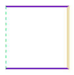
Result of the task (view in Chrome)
The CSS border property is used to create the border of an object, namely the thickness of the border, its color and style. This property is widely used in HTML. You can create various effects to better perceive the content on the page. For example, design a sidebar, website header, menu, etc.
1. CSS border syntax
border : border-width border-style border-color | inherit;
- border-width - border thickness. You can set it in pixels (px) or use the standard values thin, medium, thick (they differ only in width in pixels)
- border-style - style of the displayed border. Can take the following values
- none or hidden - cancels the border
- dotted - dotted frame
- dashed - frame made of dashes
- solid - simple line (most often used)
- double - double frame
- groove - grooved 3D border
- ridge, inset, outset - various 3D frame effects
- inherit - the value of the parent element is applied
- border-color - border color. Can be set using specific name colors or RGB format(see names of html colors for the site)
The values in the CSS border property can be set in any order. The most commonly used sequence is “thickness style color”.
2. Examples with different CSS borders
2.1. Example. Different border design styles border-style
border-style: dashedborder-style: dashedborder-style: solidborder-style: doubleborder-style: grooveborder-style: ridgeborder-style: insetborder-style:outsetFour different frames
border-style: dotted
border-style: dashed
border-style: solid
border-style: double
border-style: groove
border-style: ridge
border-style: inset
border-style:outset
Four different frames
2.2. Example. Change frame color on mouse hover
This example is very simple but interesting. It shows how you can use the :hover pseudo-class and CSS frame border to create simple effects(for example, for a menu).
When you hover your mouse over a block, the frame color will change
This is what it looks like on the page:
2.3. Example. How to make a transparent border frame
The frame can be made transparent. This effect is rare, but can sometimes be very useful for web designers. To set transparency, you need to use the color set in the form RGBA (R, G, B, P), where the last parameter sets the transparency ( real number from 0.0 to 1.0)
This is what it looks like on the page:
3. Border thickness: border-width property
Sets the line thickness. Previously, we specified it in a single description of border.
CSS Syntax border-width
border-width: thin | medium | thick | meaning;
- thin - thin line thickness
- medium - average line thickness
- thick - thick line thickness
Below are some examples. The most unusual thing will be the different thickness of the border on each side.
border-width: thinborder-width: mediumborder-width: thickDifferent thickness at the borders
This is what it looks like on the page:
border-width: thin
border-width: medium
border-width: thick
Different thickness at the borders
4. How to make a border frame on only one edge (border)
The CSS border property has derived properties for setting one-sided borders on an element:
- border-top - to set the border at the top (top border)
- border-bottom - to set a border at the bottom (bottom border)
- border-right - to set the border on the right (right border)
- border-left - to set the border on the left (left border)
These boundaries can be combined, i.e. Write your own frame for each direction. The syntax is exactly the same as border.
There are also properties
- border-top-color - set the color of the top border
- border-top-style - setting the style of the top border
- border-top-width - setting the thickness of the top border
- etc. for each direction
In my opinion, it’s easier to write everything on a line than to produce extra text in styles. For example, the following properties will be the same
/* Description of two identical styles: */
4.1. Example. Beautiful frame for highlighting quotes
Quote frame example
This is what it looks like on the page:
Quote frame example
Note
You can set a separate border for each side.
5. How to add multiple borders to an html element
Sometimes you need to make several borders. Let's give an example
5.1. First option with multiple borders
This is what it looks like on the page:
There is a second way through shadowing.
5.2. Overlay shadows to create multiple borders
This is what it looks like on the page:
6. Rounding corners at borders (border-radius)
For creating beautiful frames use the CSS border-radius property (only available in CSS3). It can be used to create rounded corners, which creates a completely different look. For example
7. CSS Indented Line
Pressed lines can look impressive on dark background, which is not suitable for every site.
This is what it looks like on the page:
To access border from JavaScript, you need to write the following construction:
document.getElementById("elementID").style.border="VALUE"
I'm sure you're already familiar with the border css property. Do you learn something new that you didn't know before? css border? Well, not only will you learn, but you will also see several new things that you never knew before!
Not only can CSS3 be used to create rounded corners, but pure CSS code can also be used to create complex shapes. Previously, you could use background-image to create the appearance of rounded corners. Thanks to new techniques for using border, we can do this with pure CSS code.
Basics of using css border
You are probably already familiar with standard use border properties:
Border: 1px solid black;
The code above will output a 1px border that will be black. Simply and easily. You can also expand the syntax a little:
Border-width: thick; border-style: solid; border-color: black;
As an addition, you can use specific values for the border-width property, three keywords: thin, medium, thick.
But using the extended syntax is not always practical. Let's look at an example where you need to change the color of a block frame when you hover the mouse. In this case, using the shorthand syntax is much simpler:
Box ( border: 1px solid red; ) .box:hover ( border: 1px solid green; )
A more elegant and simpler way to do this is:
Box ( border: 1px solid red; ) .box:hover ( border-color: green; )
As you can see, the advanced technique is also useful when we change only some properties: width, style, color and others.
Border-Radius
Border-radius- This is the "golden" property of CSS3 - the first, most common property that became practical and useful. Except for IE8 and versions below, all browsers display rounded corners using this.
Although, it is necessary to use special prefixes for Webkit and Mozilla for the styling to be correct.
Webkit-border-radius: 10px; -moz-border-radius: 10px; border-radius: 10px;
Nowadays, we can remove the special prefixes and use the standard border-radius form.
Another perk is that we can use special values for each side of the block:

Border-top-left-radius: 20px; border-top-right-radius: 0; border-bottom-right-radius: 30px; border-bottom-left-radius: 0;
In the code above, setting border-top-right-radius and border-bottom-left-radius to "null" can achieve some amazing shapes. Although the element may inherit some properties that will need to be reset.
Similar to margin and padding, we can compress the syntax:
/* top left, top right, bottom right, bottom left */ border-radius: 20px 0 30px 0;
As an example, applications border-radius properties, I’ll show you the “lemon” that designers often use when designing websites:
Lemon ( width: 200px; height: 200px; background: #F5F240; border: 1px solid #F0D900; border-radius: 10px 150px 30px 150px; )

Let's go beyond the basics
Many designers have all the knowledge in css areas border properties end here. But there are some other cool things you can use to create amazing things!
Complex css border structures
There are many techniques for creating designs using complex border structures. For example, let's look at the following...
Border-Style
We always use the most famous properties solid, dashed and dotted. But there are a couple of others border-style properties: groove and ridge.
Border: 20px groove #e3e3e3;
Or in extended syntax:
Border-color: #e3e3e3; border-width: 20px; border-style: groove;

While these properties are useful, they are not the basis for creating complex frames.
Outline
The most popular technique for creating a double border is using the outline property.
Box ( border: 5px solid #292929; outline: 5px solid #e3e3e3; )

This method works great, although it limits us to only two frames. Sometimes you need to create a gradient border that consists of many layers... how then?
Pseudo-elements
When the outline technique is not enough, alternative means is to use the pseudo elements:before and:after. With which you can add additional frames to an element:
Box ( width: 200px; height: 200px; background: #e3e3e3; position: relative; border: 10px solid green; ) /* Create two boxes with the same width of the container */ .box:after, .box:before ( content: ""; position: absolute; left: 0; .box:after ( border: 5px solid yellow; ) .box:before ( border : 10px solid blue )

It doesn't look very elegant, but at least it works. It's a little difficult to figure out the sequence of colors within the frames... but you can figure it out.
Box-Shadow
An interesting "children's way" to create a similar effect is to use the CSS3 box-shadow property:
Box ( border: 5px solid red; box-shadow: 0 0 0 5px green, 0 0 0 10px yellow, 0 0 0 15px orange; )

In this case, we were smarter and used a dedicated box-shadow property. By changing the x, y, blur parameters to zero, we can use different colors to create multiple frames.
But there is a problem: in older browsers that do not understand the box-shadow property, only one 5px red frame will be visible.
“Remember! The site design should look cross-browser, that is, the same in all browsers. Including older versions."
Changing angles
In addition to the one used simple meaning border-radius, we can specify two separate ones - separating them through / we will indicate the horizontal and vertical radius.
For example:
Border-radius: 50px / 100px; /* horizontal radius, vertical radius */
... this is equivalent to:
Border-top-left-radius: 50px 100px; border-top-right-radius: 50px 100px; border-bottom-right-radius: 50px 100px; border-bottom-left-radius: 50px 100px;
This technique is suitable for creating unique block shapes. For example, here's how to create a wrapped paper effect:
Box ( width: 200px; height: 200px; background: #666; border-top-left-radius: 15em 1em; border-bottom-right-radius: 15em 1em; )

CSS forms using border
This technique shows how you can create CSS forms, while using elements with zero height and width dimensions. Surprised? Let's look at an example...
For the next few examples, we will use the following markup:
...and the following basic style:
Box ( width: 200px; height: 200px; background: black; )
Most common example using CSS forms - creating a flowing arrow. The secret to this arrow lies in creating a border with a different color for each side. Then, set the width and height attributes to 0.
Assign to div block arrow class:
Arrow ( width: 0; height: 0; border-top: 100px solid red; border-right: 100px solid green; border-bottom: 100px solid blue; border-left: 100px solid yellow; )
To demonstrate, we first use the extended syntax. Next, we can remove the extra code using the shorthand syntax:
Arrow ( width: 0; height: 0; border: 100px solid; border-color: red green blue yellow; )

Interesting, isn't it? Now we will install transparent colors on all sides except the blue side.
Arrow ( width: 0; height: 0; border: 100px solid; border-bottom-color: blue; )

It turned out great! But this contradicts semantic layout , create an .arrow div, just to add an arrow to the page. For this purpose, we can use pseudo-elements, which is what we will do now.
Create a Speech Bubble
To create a Speech Bubble, we need a small piece pure CSS code and one div block.
Speech-bubble ( position: relative; background-color: #292929; width: 200px; height: 150px; line-height: 150px; /* vertically center */ color: white; text-align: center; )

Speech-bubble:after ( content: ""; )
At this stage, we will create the arrow that we made before, add it to the element and all that remains is to position it:
Speech-bubble:after ( content: ""; position: absolute; width: 0; height: 0; border: 10px solid; border-color: red green blue yellow; )

If we want the arrow to point downwards, we will have to set all borders to transparent except the top one.
Speech-bubble:after ( content: ""; position: absolute; width: 0; height: 0; border: 10px solid; border-top-color: red; )

When we create this CSS shape, we cannot specifically indicate the size of the arrow. Instead, we can set the border-width property, which will assign a size to the arrow. We will also set the position of the arrow at the bottom in the middle. Accordingly, for this we use the values top and left.
Speech-bubble:after ( content: ""; position: absolute; width: 0; height: 0; border: 15px solid; border-top-color: red; top: 100%; left: 50%; )

In addition, we just need to give it a color the same as the block. Remember, when positioning, you need to take into account the size of the other borders, which are invisible (15px). We will also give the block rounding at the corners.
Speech-bubble ( /* … other styles */ border-radius: 10px; ) .speech-bubble:after ( content: ""; position: absolute; width: 0; height: 0; border: 15px solid; border-top -color: #292929; top: 100%; margin-left: -15px; /* adjust for border width */ )

Not bad, huh? Using several CSS classes and border tricks, you can create such a thing.
/* Speech Bubbles Usage: Apply class .speech-bubble and .speech-bubble-DIRECTION as shown below
Bonus! Vertical centering within the block
For one line of text, you can use line-height. But if you have two or more lines of text... The best solution will install display property on table, and put all the text in a paragraph. This is what it looks like on html markup:
Speech-bubble ( /* other styles */ display: table; ) .speech-bubble p ( display: table-cell; vertical-align: middle; )

We don't limit ourselves to triangles. CSS is capable of rendering different shapes- even hearts and a biohazard sign.

Biohazard ( width: 0; height: 0; border: 60px solid; border-radius: 50%; border-top-color: black; border-bottom-color: black; border-left-color: yellow; border-right- color: yellow)


