Adaptive slider without javascript on css3. A simple jQuery slider with technical documentation. Responsive Slider for WordPress
CSS sliders have some advantages over Javascript sliders. One of these benefits is loading speed. Not only are images used for sliders large sizes(if there is no optimization for different screens), it also takes some time to load scripts. But in the article you will only see sliders using pure CSS.
Here's what I found on a website about sliders:
1. CSS3 image sliderA CSS slider that uses radio buttons to navigate slides. These radio buttons are located under the sliders. Also, in addition to radio buttons, navigation is carried out using arrows on the left and right. To keep track of which image is currently displayed, the :checked pseudo-classes are used.
2. CSS3 image slider with thumbnailsUnlike the previous CSS slider, here instead of radio buttons at the bottom there are thumbnails of all images, which is also convenient when creating an image gallery. The images change with a peculiar effect: they smoothly disappear when enlarged.
3. Gallery with CSSBut this CSS slider is perfect for sales pages. As a rule, when developing landing pages (selling pages), many web developers place a slider at the very beginning, so that on the first screen (without scrolling) the visitor immediately sees all the benefits that are available to him on this page. Besides everything, this slider is adaptive, which is also nice.
4. CSS slider without linksI would like to note right away that this slider does not use links! By default, in addition to the main image (slide), 2 more slides are visible. They are located behind the main one. Changing slides occurs in a beautiful mode: first, two slides are moved apart and the slide that will then become the main one becomes centered. The slide is then enlarged and placed in front of the others.
5. Responsive CSS3 SliderAnother adaptive slider, the control of which is based on radio buttons. To see how this slider will look on different devices, you can either change the browser window yourself, or on the page with the slider there are special icons for different devices, by clicking on which you will see how the slider will look on a computer, tablet or smartphone.
***BONUS SLIDER***In addition to all the sliders presented above, I want to please you with one more. This slider is perfect for creating an image gallery. You can’t explain in words what he does, so it’s better to watch everything in the video:
ConclusionUsing sliders, you can beautifully design image galleries, placing them more compactly, insert a slider into the first screen (the part of the page that is visible without scrolling) of the sales page to immediately show the visitor the main benefits that he will receive. You can still find a lot of ways where and how you can use sliders, but one thing is clear - they are useful when used correctly.
05/18/15 48.9KIf you need to add a high-quality jQuery image slider to your site, then in this article you will find a description required plugins. Even though JQuery has made working with JavaScript much easier, we still need plugins to speed up the web design process.
We can make changes to some of these plugins and create new sliders that are much more suitable for the purposes of our site.
For other sliders, you simply add titles, images, and select slide transition effects that come with the slider. All of these plugins are accompanied by detailed documentation, so adding new effects or functions to them will not be difficult. You can even change event-based triggers if you're an experienced JQuery programmer.
Latest trends such as adaptive design, are very important for web projects, whether you are implementing a plugin or a script. All of these elements make each of these plugins very flexible. Everything that came out in 2014 is included in this list.
JQuery image sliders Jssor Responsive SliderI recently came across this powerful jQuery slider and was able to see first hand that it does its job very well. It contains limitless possibilities, which can be extended using the open source slider code:
- Adaptive design;
- More than 15 customization options;
- More than 15 image changing effects;
- Image gallery, carousel, full screen size support;
- Vertical banner rotator, list of slides;
- Video support.
Demo | Download
PgwSlider - responsive slider based on JQuery / ZeptoThe only task of this plugin is to show slides of images. It is very compact, since the JQuery files are only 2.5 KB in size, which allows it to load really quickly:
- Adaptive layout;
- SEO optimization;
- Support for different browsers;
- Simple image transitions;
- The archive size is only 2.5 KB.
Demo | Download

A flexible and useful JQuery slider designed for news resources with a list of publications on the left side and an image displayed on the right:
- Adaptive design;
- Vertical column for switching news;
- Expanded headers.
Demo | Download

This slider does not contain jQuery, but I would like to present it as it is very compact and can significantly reduce page loading time. Let me know if you like it:
- Adaptive layout;
- Simple design;
- Various slide changing options;
- Minimal JavaScript code;
- The size is only 3KB.
Demo | Download

A document-scattered-on-a-desk style gallery with a flexible layout and beautiful design should be of interest to many of you. More suitable for tablets and large displays:
Demo | Download

HiSlider has introduced a new free jQuery slider plugin with which you can create a variety of image galleries with fantastic transitions:
- Adaptive slider;
- Does not require programming knowledge;
- Several amazing templates and skins;
- Beautiful transition effects;
- Support for different platforms;
- Compatible with WordPress, Joomla, Drupal;
- Ability to display different types of content: images, YouTube video and Vimeo videos;
- Flexible setup;
- Useful additional features;
- Unlimited amount of content displayed.
Demo |Download

WOW Slider is responsive jQuery slider images with amazing visual effects (domino, rotate, blur, flip and flash, fly out, blinds) and professional templates.
WOW Slider comes with an installation wizard that allows you to create fantastic sliders in seconds without having to understand code or edit images. Versions of the plugin for Joomla and WordPress are also available for download:
- Fully responsive;
- Supports all browsers and all types of devices;
- Support touch devices;
- Easy installation on WordPress;
- Flexibility in configuration;
- SEO-optimized.
Demo |Download

Nivo Slider is known all over the world as the most beautiful and easy to use image slider. Nivo plugin Slider is free and released under the MIT license:
- Requires JQuery 1.7 and above;
- Beautiful transition effects;
- Simple and flexible to configure;
- Compact and adaptive;
- Open source;
- Powerful and simple;
- Several different templates;
- Automatic image cropping.
Demo |Download

The idea was inspired by Apple's sliders, in which several small elements can fly out with different animation effects. The developers tried to implement this concept, taking into account the minimum requirements for creating simple design an online store in which the “flying” elements represent various categories:
- Adaptive layout;
- Minimalistic design;
- Various drop-out and slide changing effects.
Demo |Download

A very simple slider that occupies 100% of the page width and adapts to screen sizes mobile devices. It works with CSS transitions, and images are “stacked” along with anchors. The anchor can be replaced or removed if you do not want to attach a link to the image.
When installed, the slider expands to 100% of the screen width. It can also automatically reduce the size of slide images:
- Adaptive JQuery slider;
- Full size;
- Minimalist design.
Demo |Download

Elastic Content Slider automatically adjusts the width and height based on the dimensions of the parent element. This is a simple jQuery slider. It consists of a slide area at the top, and a navigation tab bar at the bottom. The slider adjusts its width and height according to the dimensions of the parent container.
When viewed on small diagonal screens, the navigation tabs turn into small icons:
- Adaptive design;
- Mouse click scrolling.
Demo |Download

An experimental slider that scrolls through images in 3D. The two stacks resemble stacks of paper, from which, when scrolled, images are displayed in the center of the slider:
- Adaptive design;
- Flip - transition;
- 3D effects.
Demo |Download

This tutorial will show you how to create a slider with a twist: the idea is to “cut” and display the current slide as you open the next or previous image. Using JQuery and CSS animation, we can create unique transition effects:
- Adaptive design;
- Split transition;
- Full screen slider.
Demo |Download

No unnecessary bells and whistles, less than 3KB in size. Use any HTML code for your slides, extend it with CSS. Everything related to Unslider is hosted on GitHub:
- Support for various browsers;
- Keyboard support;
- Height adjustment;
- Adaptive design;
- Touch input support.
Demo | Download

A simple and compact plugin (only 1 KB in size) that creates a responsive slider using elements inside a container. ResponsiveSLides.js works with a wide range of browsers, including all versions of IE from IE6 and above:
- Fully responsive;
- Size 1 KB;
- CSS3 transitions with the ability to run via JavaScript;
- Simple markup using bulleted lists;
- Ability to customize transition effects and viewing duration of one slide;
- Supports the ability to create multiple slide shows;
- Automatic and manual scrolling.
Demo |Download

Camera is a plugin with many transition effects, adaptive layout. Easy to set up, supported by mobile devices:
- Fully responsive design;
- Signatures;
- Ability to add videos;
- 33 various colors icons
Demo |Download

SlidesJS is adaptive plugin for JQuery (1.7.1 and higher) with support for touch devices and CSS3 transitions. Experiment with it, try a few ready-made examples to help you figure out how to add SlidesJS to your project:
- Adaptive design;
- CSS3 transitions;
- Support for touch devices;
- Easy to set up.
Demo | Download

This is a free responsive jQuery slider:
- Fully responsive – adapts to any device;
- Horizontal, vertical slide change;
- Slides can contain images, videos or HTML content;
- Expanded support for touch devices;
- Using CSS transitions for slide animation (hardware acceleration);
- API callbacks and completely public methods;
- Small file size;
- Easy to implement.
Demo |Download

The best responsive slider. A new version was modified to increase speed and compactness.
Demo | Download

Galleria is used on millions of sites to create image galleries in high quality. The number of positive reviews about her work is simply off the charts:
- Completely free;
- Full screen viewing mode;
- 100% adaptive;
- No programming experience required;
- Support for iPhone, iPad and other touch devices;
- Flickr, Vimeo, YouTube and more;
- Several topics.
Demo | Download

I present to you a jQuery image slider written specifically for responsive web design. Blueberry is an experimental open source image slider plugin that was written specifically to work with responsive templates:
- Minimal design;
- Adaptive layout;
- Presentations.
Demo | Download

Are used standard elements first version of the program: the slider disappears to the left and pops up to the right. The same navigation elements and captions that pop up on mouseover:
- Adaptive design;
- Signature support;
- Slide show mode.
Demo | Download

Try this amazing plugin. Animation of several elements when displaying images with settings for each of them. FractionSlider is a jQuery plugin for images or text. It allows you to animate multiple slide elements at once. You can set different animation methods, such as changing frames or moving in a certain direction:
- Adaptive design;
- Animation of elements;
- Manage animation settings;
- Background animation.
Demo |Download

With FlexSlider we can code a slider with an "impressionistic" interface. The plugin allows you to add functionality and styles via CSS3. I hope you enjoy it and use it in your projects. Let's list its functions:
- Adaptive design;
- Fade effects;
- Arrows left, right;
- Green buttons.
Demo |Download

It comes with four themes, and only the most sophisticated ones, such as the Apple-style slider and the horizontal parallax slider, are not responsive:
- Three free themes;
- Sliding horizontal parallax;
- Apple style;
- Adaptive themes;
- Support for touch devices;
- Easy modification;
- Support for different browsers.
Good bad
In this tutorial, we'll create a simple responsive header page decorated with a carousel in which images slide from right to left. Our solution does not use JavaScript, the slideshow is based on CSS3 animations, which are supported in most modern browsers: Firefox 15+, Chrome 22+, Safari 5.1+, Opera 12.1+ and IE10.


We will need 4 large images (in our example the size is 1200px x 390px). For a horizontal slider, we will prepare a 4800px x 390px image in Photoshop, place all our images one after another horizontally and save the result in a format suitable for the web (“slider-horizontal.jpg”).
Step 2 - HTMLWhat we'll actually be doing is animating the background-position property for our header. The header itself has very simple markup:
L'ile de Batz
The complete page code looks like this:
L"ile de Batz Once upon a time…
Aenean lacinia bibendum...
Links to learn by heart.. Step 3: Mobile CSSWe'll start defining styles for mobile devices. Let's set the basic design and then add template extensions for larger screens. The text of the lesson provides only the basic properties; the full code can be viewed in the source code:
Body ( width: 90%; min-width: 300px; max-width: 1200px; margin: 0 auto; padding-top: 1em; color: #504331 ) header ( text-align: center; position: relative; ) h1 ( font-size: 2.75em; background: white; padding: 0 10px; margin-bottom: .25em; ; left: 0; top: .5em; border-top: 1px solid #504331; border-bottom: 1px solid #504331; images/map.png) bottom center no-repeat; padding-bottom: 177px )
Step 4. Styles for Large ScreensOn big screens sections .main And .screen should be displayed differently. Section .link will have a width of 300px and will be positioned as the right one side panel, and section .main will remain on the left. We will also add a double line to separate the sections. We will determine screen width greater than 1024px using the @media query:
@media only screen and (min-width: 1024px) ( .content ( position: relative; ) .main ( margin-right: 320px; padding: .5em 20px .5em 0; /*add a double line */ border-right : 1px solid #504331; box-shadow: 2px 0 white, 3px 0 #504331; .links ( position: absolute; right: 0; top: 0; width: 300px; text-align: right; ) )
Step 5. Responsive Images in the titleLet's start working on the main part of our lesson: a responsive CSS slider in the header. First let's ensure adaptability background image.
Header ( background: url(../images/slider-horizontal.jpg) 0 bottom repeat-x; background-size: 400%; padding-bottom: 32.5%; )
Using two percentage values (400% for property background-size and 32.5% for the bottom margin) the header background will be displayed correctly regardless of the screen size.
Why 400%? We have 4 slides, so the display will be 1/4 of the background image in the header. That is, the background size should be 4 times wider than the header.
Why 32.5%? We position our background at the bottom of the header. The height of the background image is 390px, the width of the individual slide is 1200px, 390/1200 = 0.325, so the height is 32.5% of the width.

We will animate the background-position property. To display the second image property background-position should matter 33.33333% bottom, third - 66.66667% bottom, and the fourth - 100% bottom. The first image is displayed when the property value is background-position equal 0 bottom or 133.33333% bottom(we set the repetitions to repeat-x).
Each image has 25% of the "fame" time. The first is displayed from 0 to 25%, the second from 25% to 50%, the third from 50% to 75%, and the last from 75% to 100%. We set the transitions so that the image starts to slide out a little early (using a value of 5%) before 25% of its rendering time has elapsed. This is what it looks like @keyframes:
@keyframes h_slide ( 0% ( background-position: 0% bottom; ) 20% ( background-position: 0% bottom; ) 25% ( background-position: 33.33333% bottom; ) 45% ( background-position: 33.33333% bottom ; ) 50% ( background-position: 66.66667% bottom; ) 70% ( background-position: 66.66667% bottom; ) 75% ( background-position: 100% bottom; ) 95% ( background-position: 100% bottom; ) 100% ( background-position: 133.33% bottom; ) )
Please note that you need to add browser prefixes: @-webkit-keyframes (for Chrome, Safari, iOS Safari, Android) and @-moz-keyframes (for Firefox 15).
Below is the complete header code. Our “h_slide” animation repeats every 24 seconds (6 seconds for each slide) in an endless loop. Time function matters ease-out, so that each slide slows down at the end of the transition.
Header ( text-align: center; position: relative; background: url(../images/slider-horizontal.jpg) 0 bottom repeat-x; background-size: 400%; padding-bottom: 32.5%; -webkit- animation: h_slide 24s ease-out infinite; -moz-animation: h_slide 24s ease-out infinite; animation: h_slide 24s ease-out infinite)
Hi all. I want to present to your attention a very cool slider. Oooh... I see you have completely forgotten about me. Yes, yes, I’ve already disappeared, probably for six months or a year, and I absolutely don’t know how to force myself to post an article every day (although this is completely possible). Well, okay, that's not what we're talking about now. The slider is provided by Tympanus Codrops and runs on HTML5, CSS3 and TweenMax.js.
The slider does not rotate left to right or from top to bottom, but diagonally. Navigation arrows are located in the upper left corner and lower right. Navigation is also carried out by clicking on the thumbnail on the right and left. All animations are very smooth and work properly in all modern browsers. Each individual slider element has its own page, which opens when you click on the preview. The page has a photo, title, and text.

The slider is perfect for a gallery, portfolio of an artist, photographer, sculptor, in short, any person who is engaged in creative activities and has works that he wants to show on the site. A gallery on the website of a museum or exhibition would look good.
Connecting a galleryConnecting a gallery is easy
Downloading filesFirst you just need to download the source code from my website using a direct link. From the archive you need to upload the img, css and js folders to the root of the site
We connect css and js filesThen we connect scripts and styles. Styles are included by adding the following code to the tag
and scripts down the page to the closing tag
Adding a slider to the site
First, we’ll add navigation to the top of the site.
arrow drop longarrow navarrow
and then the slider itself
Memories & Thoughts 1 Automation Random Roam 2 Machines Arbitrary Words 3 Coexistence The only guide is your heart Haunted Drift 4 Bellamio Fun Diverge 5 Pastures Hopes & Dreams 6 Focus 1 Automation A tree needs to be your friend if you"re going to paint him Just let this happen. We just let this flow right out of our minds. Just relax and let it flow. Let's put some happy little clouds in our world. It"s a very cold picture, I may have to go get my coat. It's about to freeze me to death. This is gonna be a happy little seascape. Let"s go up in here, and start having some fun The least little bit can do so much. Work on one thing at a time. Don"t get carried away - we have plenty of time. Put your feelings into it, your heart, it"s your world. These trees are so much fun. I get started on them and I have a hard time stopping. 2 Machines This is probably the greatest thing to happen in my life We"re not trying to teach you a thing to copy. We"re just here to teach you a technique, then let you loose into the world. Now, we"re going to fluff this cloud. We don"t have anything but happy trees here. Let's do that again. Use see, don't plan it. Let's go up in here, and start having some fun The least little bit can do so much. Work on one thing at a time. Don"t get carried away - we have plenty of time. Put your feelings into it, your heart, it"s your world. These trees are so much fun. I get started on them and I have a hard time stopping. Now let"s put some happy little clouds in here. What the devil. A thin paint will stick to a thick paint. I"m going to mix up a little color. We'll use Van Dyke Brown, Permanent Red, and a little bit of Prussian Blue. Let "s go up in here, and start having some fun The least little bit can do so much. Work on one thing at a time. Don"t get carried away - we have plenty of time. Put your feelings into it, your heart, it"s your world. These trees are so much fun. I get started on them and I have a hard time stopping.
what are you
Image sliders are bright, striking design elements. In addition to their spaciousness, sliders offer dozens of transition effects from image to image, which in themselves have a special magnetism and attract attention. In addition, when looking at the site for the first time, you can completely accidentally stumble upon useful information when rotating the slides. By the way, there are many that already have built-in image sliders, but they can easily be replaced with other solutions, for example, from those presented below.
Have you heard of the plugin? It packs a whole collection of slideshows for use in various web projects. The package contains several professional slides and 36 animation effects when moving from one picture to another: cube, cubeRandom, block, cubeStop, cubeHide, cubeSize, horizontal, showBars, showBarsRandom, tube, fade, fadeFour, paralell, blind, blindHeight, blindWidth, directionTop, directionBottom, directionRight, directionLeft, cubeStopRandom, cubeSpread, cubeJelly, glassCube, glassBlock, circles, circlesInside, circlesRotate, cubeShow, upBars, downBars, hideBars, swapBars, swapBarsBack, random, randomSmart.
The presence of various options will allow you to customize the output of this slider in a way that is convenient for the user and site visitors.


Liquid Slider uses device-specific CSS3 stylesheets with jQuery transition effects as a fallback. You can use any HTML content. Navigation elements will be conveniently placed around your content, and the slider will adapt to the width of the screen. Make sure you have a clear understanding of what responsive design is.

The slider uses 3D animation/transitions created using CSS styles. Powered by Javascript.

The slider has all the features of adaptability. Uses Bootstrap technology. This slideshow will fit perfectly into any show and will be a great addition to it.
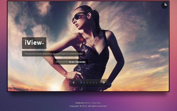
This jQuery plugin will present any content - from videos, images to individual HTML blocks. The plugin supports responsive templates and has 35 transition effects. There is a lot of choice. In addition, iView Slider can use animated HTML titles.

An excellent slider that is quite convenient to use when creating a portfolio or creating business websites. This type of slider can be found quite often on various websites.

Carousel slider for a modern web project. Works great on any type of device. It can work both horizontally and vertically, and has many nice transitions.

Here we refer to “Nivo Slider jQuery Script” because it is a powerful and completely free tool. This script has 16 transition effects, it is simple and has many interesting features.

This responsive jQuery slider has a number of beautiful visual effects(Rotate, Blur, Flip, Blast, Fly, Blinds, Squares, Slices, Basic, Fade, Ken Burns, Stack, Stack vertical and Basic linear).

We hope this review will help you make your choice and choose the most impressive image slider for your site. If you have other examples of equally great sliders, feel free to leave links to them below in the comments.


