Maintain space between letters. CSS properties. Intervals (page 1)
Leading is the vertical spacing between lines of text . It is measured from the baseline of one line of text to the baseline of the line above it. Baseline- This is the invisible line where the bottom edge of most letters is located.
The default value for auto-leading is 120% of the font typeface (for example, for a 10-point font, the leading is 12 points). When Auto Leading is used, the leading value appears in parentheses in the Leading menu in the Character panel. To change the default Auto Leading value, choose Alignment from the Paragraph panel menu and set a percentage value from 0 to 500.
By default, leading is a character attribute, meaning you can apply multiple leading values in a single paragraph. The leading of a line is determined by its largest value in that line.
Note.
When working with horizontal Asian text, you can specify how the leading should be measured: either between the baselines of two lines, or from the top of one line to the top of the next.
Baseline offset
Use the Baseline Shift option to move selected characters up or down relative to the baseline of surrounding text. Baseline offset is especially useful when manual setting fragments or adjusting the position of the font with icons.

Setting up kerning and tracking
Kerning is an increase or decrease in the interval between certain pairs of characters. Tracking is an increase or decrease in the spacing between characters in selected text or in an entire block of text.
Note.
Kerning and tracking values apply to Japanese text, but typically these settings are also used to adjust the character spacing between Latin characters.
Text kerning can be done automatically using the metric or optical kerning functions. At metric kerning(also called autokerning) uses pairs of characters that are included in most fonts. Fonts contain information about the spacing between letters in specific pairs that is used during the kerning process. Here are some of these pairs: "LA", "P.", "To", "Tr", "Ta", "Tu", "Te", "Ty", "Wa", "WA", "We" , "Wo", "Ya" and "Yo". Metric kerning is applied by default, so specific letter pairs are automatically kerned during import or input.
Some fonts include detailed instructions for kerning. However, if a font contains only minimal or no kerning information, or if a word or line uses different typefaces and point sizes simultaneously, then it may be necessary to use optical kerning. With optical kerning, the spacing between adjacent characters is chosen based on their shape.

A. Original text B. Text after applying optical kerning C. Text after manually setting the kerning value between the letters "W" and "a" D. Text after applying tracking E. Combining kerning and tracking
You can also use manual kerning, which is ideal for adjusting the spacing between two letters. Tracking and manual kerning complement each other. You can tweak individual letter pairs first and then make blocks of text more compressed or sparse. This has no effect on the relative kerning of letter pairs.
When you click and place an insertion point between two letters, the Character panel displays the kerning values. Metric and optical kerning values (or a specific kerning pair) are displayed in parentheses. Likewise, tracking values appear in the Character panel when you select a word or piece of text.
Tracking and kerning are measured in 1/1000 em. This unit of measurement is equal to the width of the widest letter in the font and allows you to set the size relative to the current typeface. For a 6 point font, 1 em is equal to 6 points. For a 10 point font, 1 em is equal to 10 points. Kerning and tracking are strictly proportional to the current font size.
Note.
Kerning and tracking values affect Japanese text, but these settings are typically used to adjust character spacing for Latin characters.
Setting kerning
To use the kerning information built into the font for selected characters, set the Kerning option in the Character panel to Automatic or Metric.
To automatically adjust the spacing between selected characters based on their shape, set the Kerning option in the Character panel to Optical.
To manually adjust kerning, place the insertion point between two characters and set the Kerning option in the Character panel to the desired value. (Note: If a piece of text is selected, you cannot manually kern the text. Use automatic tracking instead.)
Advice. To decrease or increase the kerning between two characters, use Alt+Left/Right Arrow (Windows) or Option+Left/Right Arrow (Mac OS).
To turn off kerning for selected characters, set the Kerning option in the Character panel to 0 (zero).
Additionally. For a list of keyboard shortcuts used when working with text, type “keyboard shortcuts” in the Help search bar.
Do any of next steps:
As a rule, for each font of a certain size, values are preset spaces between words, distance between letters within a word And visual line height. It should be noted that the spacing between different letters in monospaced fonts such as Courier New is always the same. In other font types letter spacing depends on letter combinations - in most cases it is fixed, but between some pairs of letters it is deliberately reduced in order to visually make the text more “even” and evenly distributed. For example, the distance between the letters AU is less than between the letters NP, since the letters N and P are straight in shape, and the letters A and U have bevels, moreover, directed in one direction. If the spacing between letters is the same, A and U will appear further apart than H and P. To soften this effect, the distance between them is slightly reduced, resulting in a visually aligned line of text. This phenomenon is one of the most striking manifestations of optical illusion.
IN CSS for text blocks, you can adjust the size of the distances between words in the text, i.e., in essence, change the size of the space. You can also change the distance between letters within a word (i.e. create dense or sparse text) and control the height text string. Line height is the distance between the baselines of two adjacent lines.
There are no analogues of such properties in HTML. Intervals can only be set using CSS.
word-spacing property
This property allows you to set the distance between words. Any unit of length is allowed as a value, both positive and negative. With negative values, the distance between words decreases, and with too large values words can get very close or even collide with each other. This will negatively affect the readability of the text, so be careful when setting such values. Specifying percentage values is not allowed.
Let's look at an example:
letter-spacing property
This property specifies the distance between letters within a word. It is set similarly to the distance between words in any units of length. It is possible to set negative values, in which the letters may be too close to each other or even overlap each other. Therefore, use it carefully. Setting the value as a percentage is not allowed.
Using this property, you can thin out letters, for example in headings, which will look quite original. It is recommended that, on the one hand, the distance between letters should be increased so significantly that the title visually stands out against the background of ordinary text, and on the other hand, the spacing should not be too large so as not to deteriorate general perception text.
Both properties word-spacing And letter-spacing can be used together because as you increase the spacing between letters, in order to maintain readability and separate words, you may need to increase the spacing between words at the same time. Here typical example header design:
| H1 (word-spacing: 2 ex; letter-spacing: 0.3 ex) |
When working with a text style, you can set the necessary spacing between characters, words, and lines. Such distances are specified in any units CSS dimensions, be it px , pt , em or others. An exception is percentages - they can be used to set the distance between lines (leading), but they do not work when setting the spacing between characters or words.
CSS character spacing: letter-spacing
Set intercharacter spacing You can use the CSS letter-spacing property. In addition to the usual values (positive and negative), you can also use the values inherit (to inherit the value from the parent) and normal (if you want to return normal spacing between characters).
An example of writing an intercharacter interval:
P ( letter-spacing: 2em; )
Spacing between words: word-spacing
The CSS word-spacing property differs from the previous one in that it sets the distance between words, not between characters. For of this property normal and inherit values are also provided. You can specify negative values. Below is an example of a style entry:
P (word-spacing: 6px; )
Line spacing: line-height
Using the CSS line-height property, you can set the distance between lines of text. As was said at the beginning of the topic, to set leading, in addition to other units of measurement, you can use percentages. It is also possible to write the value as a multiplier (numbers greater than 0): to calculate the distance, the browser will multiply the font size by given number. Negative values don't work. The available values are normal and inherit .
Below is an example of how to do it line spacing CSS:
P (line-height: 180%; )
In the screenshot you can see what the text looks like with all three properties:
Screenshot: Spacing in CSS
Results
When setting spacing between words, characters or lines, first of all make sure that the resulting text is easy to read. Such properties must be handled carefully and always used in moderation, without fanaticism, otherwise all text content threatens to turn into an illegible set of letters.
Handling spaces between letters and words
1. Distance between words word-spacing
Sets spacing between words. Positive and negative values can be used. With a negative meaning, words can overlap each other.
The word-spacing value is influenced by the value text-align properties in case of text alignment in width. Inherited.
Syntax
P (word-spacing: normal;) p (word-spacing: 2px;) 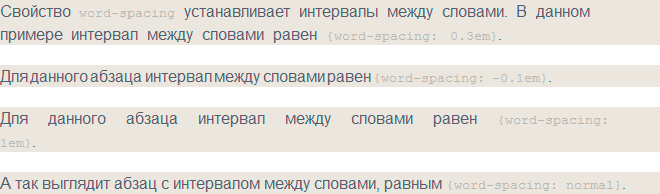 Rice. 1. Spacing between words
2. Letter-spacing
The property sets the distance between letters (tracking amount) and symbols. Can take positive and negative values. It is advisable to use to increase the expressiveness and readability of headings, definitions, etc. Inherited.
Syntax
P (letter-spacing: normal;) p (letter-spacing: 2px;) 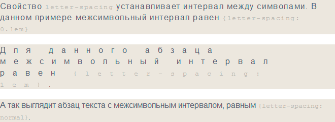 Rice. 2. Changing the distance between letters using the letter-spacing property
3. Handling white-space spaces
The property handles spaces between words and line breaks within an element. Not inherited.
| white-space | |
|---|---|
| Values: | |
| normal | Default value. Only one space is inserted between words; additional spaces are discarded. Text is only wrapped when necessary. |
| nowrap | Prohibits line breaks except when used . |
| pre | Spaces in the text are not ignored; the browser displays additional spaces and line breaks. |
| pre-wrap | Preserves whitespace in text by adding line breaks where necessary. |
| pre-line | Deletes extra spaces, except in cases . |
| initial | Sets the property value to the default value. |
| inherit | Inherits the property value from the parent element. |
Syntax
P (white-space: normal;) p (white-space: nowrap;) p (white-space: pre;) p (white-space: pre-wrap;) p (white-space: pre-line;)
4. Setting tab-size
To change the amount of indentation obtained using the TAB key, use the tab-size property. Property values are ignored when the white-space property is set to one of the three values pre-line , normal or nowrap .
Only works for elements